LJ Talks With James Weston Lewis, Illustrator and Book Jacket Designer
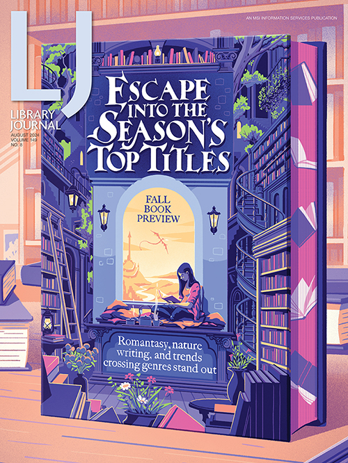
James Weston Lewis, the illustrator who created LJ’s August cover and illustrated the Fall Preview, has designed for a myriad of publishers and created covers for Frederik Backman and Cat Sebastian, as well as many others. He talks with LJ about his creative process and the art of book jackets.
 James Weston Lewis, the illustrator who created LJ’s August cover and illustrated the Fall Preview, has designed for a myriad of publishers and created covers for Frederik Backman and Cat Sebastian, as well as many others. He talks with LJ about his creative process and the art of book jackets.
What is the goal of a book cover? What roles do you think it plays?
I think the clearest goal of a book cover is to sell the book; however, I think that’s not exactly what I’m thinking of when it comes to thinking about what a cover should be. That is probably something that the designers at publishers and the people in marketing etc. are a little more focused on as they pick from the possible designs or ideas to take to market. My goal in thinking about a cover is generally to find something that feels like the story, or that looks something like what being in the world of the book feels like, and then on top of that being either visually striking enough to catch the eye, or having some element of joy or life in the details that might draw somebody to the image amongst a whole set of books on a shelf.
Can you describe your process when designing a book cover?
I think I have a fairly visual mind, so I’m picturing images a lot when I read. Having gone through a manuscript, generally something will jump out at me, whether that’s a scene that’s visually striking when described, or a sense of place that communicates through architecture or landscape, or objects of significance that have a sense of weight in holding the story. Something like that will usually be a good jumping off point to find what the feeling or vibe is, and then I can explore a bit from there. The starting point of a book cover, though, is usually a conversation. It’s fairly rare that I go into working on something with completely free rein, and I’ve worked with lots of really great designers and art directors that will have an idea of a theme, trend, or feeling that they want to highlight in the design, and that will be the start of the process. I like to try and find something that feels like it encompasses the whole of the story, again through hopefully creating a feeling that chimes with the world within the book. Sometimes that might have specificity with a scene within the book, but if the cover depicts a scene, I would usually try to make it one of a number of different things happening on the cover, or else something from early on that helps establish the feeling, I certainly don’t want to be drawing whole specific things that give away actual plot etc. within the story. I try to include fonts within my designs as it’s nice to make sure that whatever feeling I'm going for in the design is included in how the type feels and is set, but I also often work with great designers who have a better feel for text than I do, so it isn’t always my choice. When it isn’t, though, it’s nice to make that part of the discussion with the designer, as the text and image being in dialogue with each other is definitely one of the most important aspects of cover design.
What are the big book cover trends you are seeing? What do you think contributes to something becoming a trend? What drives them, changes them?
I’m not really always on top of the trends in book covers as I’m an independent freelancer, and so I don’t tend to have a broad overview of what is happening generally in publishing. I just work on the projects that are brought to me. Having said that, it’s not uncommon that I’m approached for a project because the publisher liked what I’ve done with another cover and are looking for something that has a similar feeling for another project. Things that have come up a fair bit recently have been covers with patterns and borders or formal elements that lay out the cover and hold small scenes, details, architecture, or objects that come together to give a feeling of the setting or resonance of the story. I think it makes a lot of sense that you find trends in cover designs running through genres or specific types of literature. I think often [when] I read something, I get caught up in a particular feeling or setting or sense of magic, and I often want to extend that by finding other books that feel similar. So looking across a shelf and finding something with a look that’s reminiscent of something else you enjoyed is a good way to discover new things you like, as long as they don’t become too homogenous.
 |
Illustration ©2024 James Weston Lewis |
There has been a growth in books as beautiful collector objects, with cases, edge-stamping, and special endpapers. What do you think accounts for this and what is the meaning behind it?
I’m not completely sure what’s behind this, though I’m very glad that it is the case. I would speculate that with the saturation of digital media in people’s lives, and especially the current rise of AI, people are being drawn back to physicality, and beauty in physical processes, and an obvious human hand in the design and production of beautiful things. I think that the inherent knowledge that human hands and decisions made by people have gone into creating lovely objects really informs what people find to be beautiful and worthwhile.
Can you share some of your favorite covers by you and other artists?
I’m not sure that I have a definitive top 10 or anything like that, but from an illustration perspective, these are some covers that have stuck in my mind over the last few years.

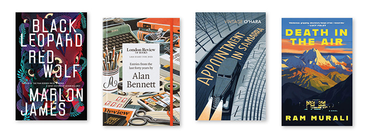
Black Leopard, Red Wolf by Marlon James, with a cover illustration by Pablo Gerardo Camacho, is one of a few books that I bought purely because of the cover. It’s such a rich and striking image, and the twisting metamorphosis really does a great job of capturing the feeling of the world within that book. Jon McNaught’s watercolour cover for Alan Bennett’s diaries is really lovely and similarly does a great job of capturing the beauty in ephemera and everyday colour that really reflects what it feels like to read Alan Bennett. One of my favourite illustrators working in book covers is Bill Bragg, who manages to create wonderfully iconic images for a whole range of different books. His covers for the Vintage O’Hara collection are particularly great. I was recently struck by the cover for Ram Murali’s Death in the Air, illustrated by Emiliano Ponzi. I haven’t yet had a chance to read it, but I think I already have an inkling of the feeling of the novel from the image—the soaring open beauty above and claustrophobic darkness below, the apparent beauty and freedom of the luxury world and the murkiness and restrictions that hide beneath it, encompassed within one striking landscape. For great covers, I think you can never go wrong with the Folio Society. Two of my favourite covers from them are relatively simple images: Bill Bragg’s cover for Kafka’s Metamorphosis and Angela Barrett’s cover for Frankenstein. Both are bold and striking and give a great sense of the novel without doing too much. One of the great things about designing a book cover for the Folio Society is that they come in a slipcase with the title on, and so you can do something really bold with a book cover that doesn’t need to have any text on it.
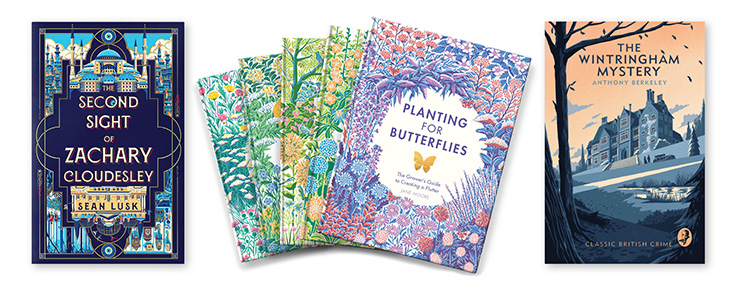
One of my own favourite cover projects was the cover for their edition of Bill Bryson’s A Walk In The Woods. Some of my own other favourite cover projects in different ways would probably be The Second Sight of Zachary Cloudesly for the fun in the details and the reversible design, The Wintringham Mystery for the atmosphere, and the "Planting For" series and The Wild Handbook for the enjoyment in making patterns and balance with natural subjects and minimal colour palletes.

Add Comment :-
RELATED
ALREADY A SUBSCRIBER? LOG IN
We are currently offering this content for free. Sign up now to activate your personal profile, where you can save articles for future viewing


