Libraries and Their Landscapes
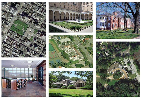
‘‘Si hortum in bibliotheca habes, deerit nihil.’’ (If you have a garden in a library, nothing is missing.)
So wrote Marcus Tullius Cicero to his friend Terentius Varro on June 13, 46 BCE, later recorded in his Letters to Friends, Book 9, Epistle 4.
Cicero was suggesting a garden in the library, where he could spend his time in a natural setting, reading, writing, and conversing with his colleagues. This ancient idea can also apply to contemporary thinking about libraries and their landscapes. How do we thoughtfully place a library in the landscape? And how can we create outdoor spaces that work in concert with the library interior?
When a new public library is planned, it is not only the design that must be considered. The placement of the building in its setting (its landscape) and the design of the landscape together with the building are fundamental parts of the planning process. Unfortunately, architectural endeavors sometimes focus almost exclusively on the building itself. How the building might relate to its setting is often an afterthought. As a result, important opportunities to enhance both the building and its site are overlooked.
What do we mean by the term landscape? J.B. Jackson (1909–96) quoted an old-fashioned but persistent definition of landscape as“a portion of the earth’s surface that can be comprehended at a glance” (The Word Itself, Yale Univ., 1984). In another essay, he asserts, “A landscape is beautiful when it has been or can be the scene of a significant experience in self-awareness and eventual self-knowledge.”
This wider definition should help planners and designers understand that every time we build, we place that building (an original creation) in an existing landscape (setting), and in doing so, we change that landscape. As architects, our job is to assure that both the building and the landscape are enhanced.
Context and creativity
A discussion about architecture often sets up a false conflict between context (setting) on one side and an object of original creation (building) on the other. In fact, there should be no argument. Response to context and creativity belong together. The best architectural solutions are contextual and imaginative. Understanding the landscape in all its capacity is the first step to deciding how to proceed. This understanding involves an examination of a series of natural factors, including subsurface geology, topography, slope, drainage, soils, vegetation, microclimate, and views, as well as a series of human-made factors that include zoning, land use, traffic, patterns of movement, neighboring buildings, and regional traditions.
The idea of landscape is a holistic, general term that is easier to comprehend when separated into the following three categories: 1) the natural landscape—that which exists before it is changed by significant human intervention; 2) the vernacular landscape—the human-made landscape formed by incremental and almost unintentional changes (e.g., the sloping agricultural terrain of southern Vermont); and 3) the designed landscape—the human-made landscape that is consciously designed, such as cities, streets, plazas, gardens, parks, shopping centers, etc.
How do these categories relate to libraries? Let us look at some prototypical examples of libraries in urban, suburban, and open landscapes.
Libraries in urban settings
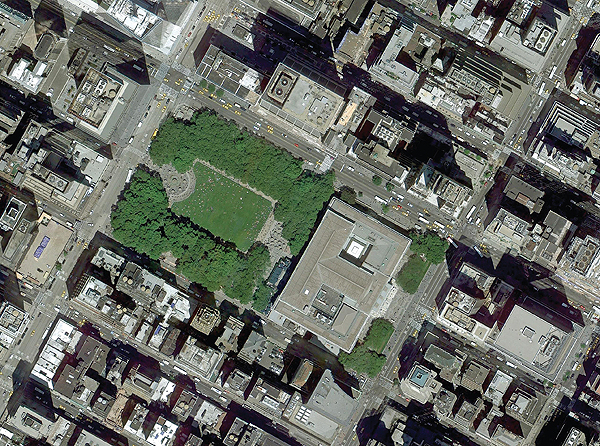
- The main facility of the New York Public Library (NYPL) occupies an extraordinary landscape between 40th and 42nd streets (north-south) and between 5th and 6th avenues (east-west), in midtown Manhattan. The neoclassical library, designed by Carrère and Hastings, was constructed between 1902 and 1911.
Over the decades, the setting (the landscape) has changed dramatically. Originally Bryant Park, the green space to the west of the library, was a reservoir set within great Egyptian Revival walls. When the reservoir was eliminated and Bryant Park constructed in 1933–34, New York obtained a beautiful green formal landscape that resembles a Parisian park. This landscape was modified brilliantly by Hanna/Olin Ltd. and Hardy Holzman Pfeiffer Associates in the 1990s to create a more public and welcoming outdoor space.
Over the decades, as the buildings that surround Bryant Park grew in height, they clearly defined an outdoor room. The elongated rectangle of NYPL forms the eastern edge of that outdoor room. The library’s grand reading room, which occupies the entire second floor, faces west with a direct view of the park. Because of the height of the surrounding buildings, this outdoor room is defined by the buildings on 40th Street, 6th Avenue, and 42nd Street and by the west façade of the library. Within the larger outdoor room is an apparent green library courtyard defined by symmetrical rows of plane trees on the north and south and by the library façade on the west.
The main entry to the library is on the west side of 5th Avenue. Since the entry is centered on the east façade, it is aligned with the east-west axis of 41st Street. Thus, even from several blocks to the east, the central bay—the entry bay—beckons people to enter the monumental public library.
The setting of NYPL can be summarized as three landscape gestures: the processional street (East 41st Street) leading to the front entrance, the public park (Bryant Park), and the reinterpreted park—the apparent library courtyard lined with rows of plane trees as experienced from the main reading room.
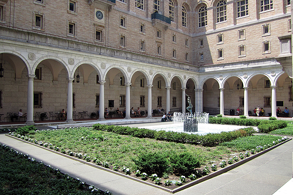 Photo by Wally Gobetz
 - In 1888, Charles Follen McKim of the architectural firm McKim, Meade and White designed the Boston Public Library (BPL) in the neoclassical style. The library defines the western edge of Copley Square in Boston and sits across from Henry Hobson Richardson’s greatest building, Trinity Church, which occupies the eastern portion of the square in an informal “Richardsonian Romanesque” fashion.
In a manner parallel to the NYPL example, the main reading room of BPL occupies the second floor and overlooks the public square. To the public landscape, McKim added a private landscape, an inner courtyard reminiscent of the courtyards of the Italian palaces of the Renaissance. It is a place of quiet and contemplation, akin to a cloister—the garden or courtyard in the library to which Cicero refers. To sum up, BPL addresses two landscapes: it holds an edge of Copley Square, and it creates its own inner courtyard.
NYPL exists in a clearly defined urban fabric, a grid of streets and avenues established by the 1811 Commissioners Plan of Manhattan Island. The public library in Boston is also situated in a gridded part of a mostly irregular city. Whereas the New York example defines the edge of a park, the Boston site defines the edge of a public plaza. In both cases, the public buildings sit at the edge of the adjacent public streets. Only BPL establishes an inner courtyard.
Libraries in suburban/village settings
A typical suburban or village setting shares many characteristics with urban sites. The most notable difference is that suburban settings are smaller scaled and are situated amid more open and greener landscapes.
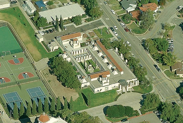
- San Juan Capistrano Library (SJCL) in Orange County, CA, was designed by Michael Graves and constructed in 1982. The library is located in a suburban setting and does not define the edge of a public outdoor space. Still, taking advantage of the California climate, the library is a true courtyard building in which the reading courtyard, the central space of the library itself, organizes and defines the building. Perhaps more than any other example, SJCL exemplifies the garden within the library, almost as though it were an ancient Roman peristyle courtyard house in which all the rooms surround an outdoor space.
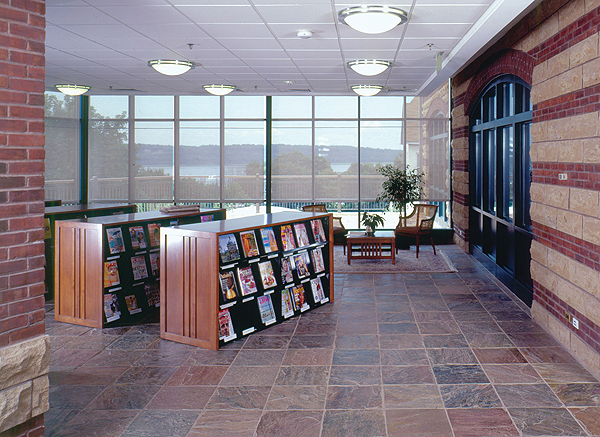
- Dobbs Ferry Public Library (DFPL), NY, completed in 2001, was designed by Peter Gisolfi Associates [the author of this article is the firm’s principal-in-charge of design]. It occupies two distinct landscape settings: a townscape location and a river valley. The building consists of two rectangular solids that follow the geometry of the bend in Main Street and thus create an entry courtyard on the eastern side of the building. At the same time, the library occupies a west-facing slope, offering views of the Hudson River and the Palisades. The building responds to this wider setting in two ways: first, the entry pavilion and its open reading terrace face directly to the Hudson River view as do other critical parts of the building; second, the masonry building and its clocktower can be seen from the Hudson River. In fact, the view from the Hudson is of a series of masonry buildings with towers, which denote civic importance in the Village of Dobbs Ferry.
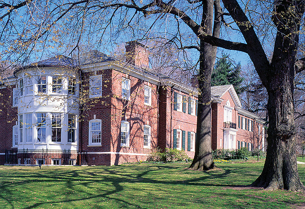 Photo by Norman McGrath
 - Bronxville Public Library, NY, was designed by Harry Leslie Walker in 1942 to resemble a gracious house with a distinguished art collection (next page). Peter Gisolfi Associates designed the renovation and expansion of the library (doubling its size) in 2001. The library occupies one of four important civic corners at the intersection of Pondfield Road and Midland Avenue. The main entrance is directly across the street from the Village Hall, creating an axial connection between the two buildings. The two remaining corners contain the elementary school and the Reformed Church.
The bow window rooms of the library (on two floors) overlook the green space of the four corners (the Village Green). The building is sited as though it were a large and imposing Georgian house occupying a generous site of open lawns and old trees on three sides, with a more defined garden to the south.
These three suburban examples are dramatically different. The streetscape response is clear in Dobbs Ferry, where the bend in Main Street determines the configuration of the library’s entry plaza. In response to the broader landscape, DFPL allows for views over the Hudson and, at the same time, becomes part of the suburban village fabric, which can be seen from the river itself. By contrast to the streetscape approach, the inner courtyard at SJCL is an essential component of the library spaces that are used by its patrons. Finally, the public library in Bronxville addresses the village green formed on four corners by the church, the school, the village hall, and the public library. The wider green landscape links the four buildings and creates a civic open space of importance.
Libraries in open landscapes
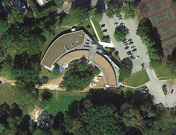
- Tredyffrin Public Library in Strafford, PA, was designed by the firm of Mitchell/Giurgola Architects and completed in 1975. It is notable in terms of its relationship to the setting: the library is not located in the center of town. It is instead situated on an open landscape with a long view. The architects’ response to the setting is a building that forms an arc, where patrons throughout the library can engage the landscape—much as you might design a house on an open site and every room overlooks the property. The arc itself creates a somewhat protected landscape adjacent to the building, which serves as the terrace for the longer view.
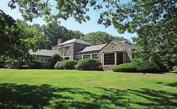 Photo by PGA Staff
 - Scarsdale Public Library, NY, occupies an open site adjacent to the intersection of Route 22 and Olmsted Road. It was designed by Hunter McDonnell and Raphael Hume in 1951 and expanded in 1975 and again in 1998 by the firm of Gibbons, Heidtmann and Salvador. The library is a collection of relatively small rooms in a meandering stone building that engages its surroundings in many anecdotal gestures. The most compelling view is toward a small pond on the western side of the library. Two sides of the building are surrounded by landscaped spaces. The key point is that this building does not seek to define outdoor spaces but simply occupies the open landscape.
The open landscape is usually an exurban setting. At Tredyffrin and Scarsdale, the library buildings are surrounded by green space. Tredyffrin opens to one compelling view, and the plan of the building is shaped to take advantage of it. On the Scarsdale site, the surrounding views are relatively equal, and the building responds casually to a variety of situations.
Occupy and engage
How is the landscape engaged, and to what extent is the landscape defined or formed by the library building? In the urban examples mentioned here, the two libraries are fabric buildings that follow the gridded street pattern and occupy important sites. Simultaneously, they define the edges of important urban outdoor spaces. With NYPL, the connection to fabric is enhanced by the axial view on 41st Street. In both the urban and suburban examples, the possibility exists to form a smaller- scale, defined, and often private landscape—the inner courtyard at BPL, the defining courtyard at SJCL, and the entry courtyard and reading terrace at DFPL.
Finally, on the open sites, the library seems to occupy the site rather than to define it. A slight exception exists at Tredyffrin, where the landscape adjacent to the arc of the building becomes a terrace for the library.
The most obvious conclusion is that in all its guises, the landscape is taken into account by these seven buildings. It is almost impossible to think of the New York Public Library without considering Bryant Park. The Boston Public Library belongs on Copley Square. The Bronxville Public Library is part of the village green. The San Juan Capistrano Library surrounds a courtyard. The Dobbs Ferry Public Library belongs to a village street, yet is part of the Hudson River Valley. The Tredyffrin and Scarsdale libraries simply occupy their open landscapes.
In every case, the library and some aspect of a garden are present—hence, nothing is missing.
RELATED
ALREADY A SUBSCRIBER? LOG IN
We are currently offering this content for free. Sign up now to activate your personal profile, where you can save articles for future viewing




Add Comment :-
Comment Policy:
Comment should not be empty !!!
Jane Roy Brown
What a marvelous appreciation of integrated indoor-outdoor contemplative space. Bravo! If you have not already done so, make the trip to one of the most magical library gardens of all time, Fletcher Steele's Amphitheater Garden for the Camden (Maine) Public Library. Set and setting reward the journey. See https://docs.google.com/viewer?url=http%3A%2F%2Fwww.lalh.org%2FVIEW_PDF%2Fview03.pdfPosted : Dec 18, 2012 09:19
Harriet Shalat
Interesting article. However, the information about NYPL's main library is not entirely correct. The magnificent Rose Reading Room (General Research Division) is on the third floor (not the second), and it isn't the only reference area on the floor. The Art and Architecture Collection, Berg Collection of English and American Literature, Manuscripts and Archives Division, Photography Collection, Print Collection, Rare Books Division, Arents Collection on Tobacco, Spencer Collection, and the Pforzheimer Collection of Shelley and His Circle also are on the third floor.Posted : Dec 17, 2012 12:14
Paula Sequeiros
Dear Peter Gisolfi, I'm very happy to read this piece, it is not common to have library buildings and their settings analyzed in a comprehensive way. I've researched how library architecture and urban insertion of library buildings interrelate to the social relations woven by readers and library professionals. I was particularly intrigued by the fact that two (very) different public library buildings in the same city – Porto, Portugal - appeared to shape reading practices in different ways too. A recently published paper, written with an architect – Silvia Grunig – addresses that question (Sequeiros, Paula, and Silvia Grünig. 2012. It is an ethnographic based research, comprising interviews to readers and 'author' architects and observation. It is available here: “A tale of two libraries: space, place and reading in Porto’s public libraries.” Pp. 247–288 in Libraries driving access to knowledge, edited by Jesús Lau, Anna Maria Tammaro, and Theo J. D. Bothma. The Hague: IFLA, de Gruyter Retrieved (http://www.degruyter.com/view/books/9783110263121/9783110263121.247/9783110263121.247.xml). Taking advantage from the opportunity your post and Library Journal gave me, I'm sharing this paper and hoping it may be useful for persons with similar concerns. Paula SequeirosPosted : Dec 13, 2012 03:15