4 Design Challenges from Pikes Peak | Design Institute Colorado Springs
At LJ’s 2019 Design Institutes in Colorado Springs, CO, held at the Pikes Peak Library District (PPLD) on September 13, four public libraries in California, Idaho, Texas, and Arizona enlisted architects and attendees to brainstorm on upcoming library design challenges.
Campbell Library, CA
ARCHITECT Arch } Nexus
THE CHALLENGE Situated just a few blocks from eBay headquarters, Campbell Library serves a diverse population of young professionals, tech folks, and commuters, as well as poorer Chinese-, Vietnamese-, and Spanish-speaking residents from San José. According to Campbell Librarian Peggy Tomasso, the library’s current design prevents giving users the best experience and service possible. One entrance, from the parking area, has non–ADA compliant ramps to its upper and lower levels. A grassy moat surrounds the lower level, and people experiencing homelessness have set up camp there. Wayfinding and security are concerns, with a single elevator and small stairwell at one end of the building connecting the two floors. Another missing element, said Tomasso, is quiet space.
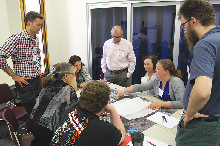
THE BRAINSTORM ArchNexus’s Jeff Davis and Aaron Arbuckle divided the group into three teams, each tackling connections, wayfinding, and security; major functions; and operational functions and sight lines. “How do we open up the space and connect the two floors?” queried Davis. Suggestions included filling in the moat to expand programmable outdoor space, adding an amphitheater for storytime, putting in an atrium and a glass- enclosed staff workroom downstairs, and situating the stairwell in the center of the library rather than on one side. To better market the library, prune shrubs on the lower level so people can see inside and activate the adult area with computers and technology. Davis’s big idea was to take advantage of natural light with a skylight across the entire top of the library and glass entries at both ends, so users and staff can see all the way through. “Putting the money in the right place changes everything,” he concluded.—Francine Fialkoff
Eagle Public Library, ID
ARCHITECT Group 4 Architecture, Research + Planning, Inc.
THE CHALLENGE The booming bedroom community of Eagle, seven miles northwest of Boise, has grown nearly tenfold in the last 30 years and is expected to double again in the next 20. The Eagle Public Library has seen a corresponding dramatic increase in services and programming, and the 1999 building is struggling to meet patrons’ present needs.
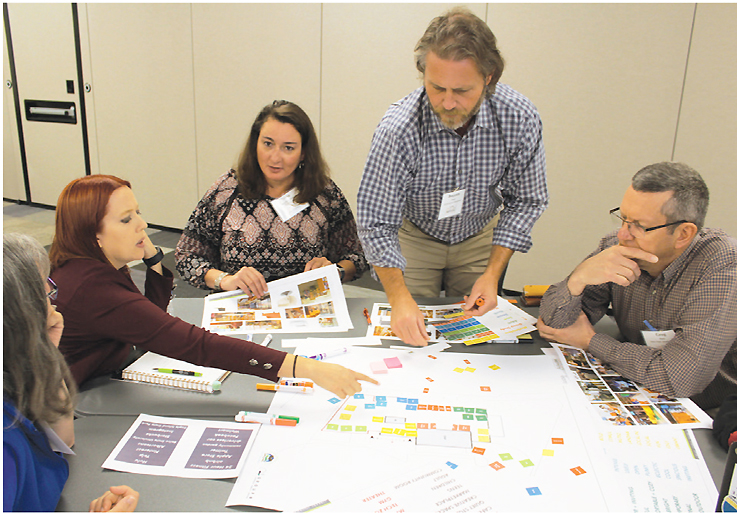
THE BRAINSTORM Eyres and Principal Andrea Gifford handed out “game boards”—outlines of the library’s current floor plan. (Two tables were given plans with an expanded footprint.) Groups collaborated to collage their plans with paper squares identifying areas, functions, furnishings, and descriptions. Fill the space, the architects advised, while talking about ideas and the reasoning behind them. While each group’s floor plans varied widely, several common themes emerged. With a limited amount of space, flexibility would be critical; movable panels or white boards could delineate study or meeting spaces to serve as buffers between youth and adult areas, with garage-type doors opening to the patio in good weather. A “marketplace,” with new titles and best-sellers, could form the library’s central spine. And, all agreed, sight lines across the single floor should be improved in order to keep teen and children’s areas within view of service points—and to keep the peace.—Lisa Peet
Preston Royal Branch, TX
ARCHITECT Margaret Sullivan Studio
THE CHALLENGE Located in an affluent suburb, the Preston Royal Branch of the Dallas Public Library serves a wide range of users, from retirees looking for a traditional library experience to busy parents seeking engaging programming for children. The branch also serves as a community hub, attracting users from surrounding communities. Seniors often complain about the noise levels, especially during youth programs. The branch is small and features a mostly open floor plan with some stacks obscuring sightlines. Parking is limited; patrons often complain about having to park in a faraway back lot. Though not designated as a historic building, many longtime residents have great pride in the library (especially the unusual arched ceiling) and do not want renovations to strip away the core architecture. The goal is to meet the changing needs of seniors, young families, tutors, and entrepreneurs, defining dedicated spaces while offering flexibility in a small footprint.
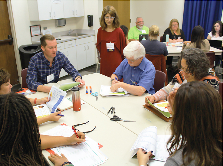
THE BRAINSTORM “Unconventional is our M.O.,” stated Margaret Sullivan Studios (MSS) designers Lyna Vuong and Maddy Orick. Using retail, service design, and human development as guides and inspiration, MSS team members used a collaborative, community-based approach. They handed out a guide describing various personas—including a young family with two working parents, a grandmother looking for intergenerational programming, and a nanny seeking to engage her young charge while sharpening her English skills, among others—and asked each group to pick one. Groups had to first answer questions: What are their needs?, What are their curiosities?, And how can the spaces help them achieve those outcomes? The teams then cut-and-pasted components onto a floor plan to design the library for their chosen persona, considering service areas, furnishing and equipment, noise levels, and traffic flows. Ideas included a mobile Maker station, moveable stacks, a much-smaller circulation desk, and an outdoor garden.—Kiera Parrott
Sedona Public Library, AZ
ARCHITECT Ratio | Humphries Poli Architects
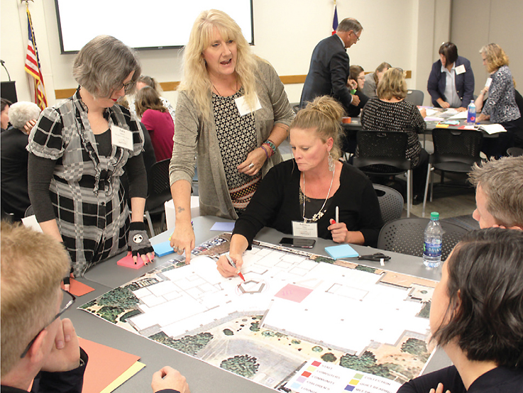
THE CHALLENGE The Sedona Public Library is evaluating a significant overhaul of the interior of its historic library to re-engage the community and reframe its services. Judy Poe, assistant director (r. photo, standing c.), detailed the challenges for a remodel, including the core construction of the building, which will make it difficult to overcome key sightline and use issues. Also, architectural features and donor acknowledgements cannot be moved. More meeting spaces, teen and children’s areas, and outdoor spaces that are adaptable and responsive are needed. The service desks should be evaluated and the backroom overhauled. Overall, Sedona would benefit from the library becoming a destination for tourists as well as community members.
THE BRAINSTORM Dennis Humphries and Ramona Burns from Ratio | HPA asked participants to discuss and imagine a new brand for the Sedona library and determine what “archetype” or library ideal would best suit that brand. The process started with a review of the human functions of the library, including its approach to engaging the community. These include being a place for dreamers, leaders, aspirers, and enablers (or disruptors) of ideas. Within those functions are recognizable archetypes (personas or brands) that could become the core of the remodeling project, e.g., an explorer, a jester, or an enchanter. According to Humphries, all the archetypes present both positive and negative attributes to assess. Next, the Ratio | HPA team led the room through a building-breaking exercise that asked several groups to consider the functions of their preferred archetype and then lay out spaces within the library to suit that archetype. This approach may take more time and iterations, but using it as a starting point can create highly responsive buildings and community-reflective designs.—John Chrastka
All photos by Kevin Henegan
See more coverage of LJ's Design Institutes and our Austin event.
RELATED
ALREADY A SUBSCRIBER? LOG IN
We are currently offering this content for free. Sign up now to activate your personal profile, where you can save articles for future viewing








Add Comment :-
Comment Policy:
Comment should not be empty !!!