5 Design Challenges from Missoula | Design Institute Missoula 2022
At LJ’s 2022 Design Institute in Missoula, MT held at the Missoula Public Library on September 29, five libraries in Idaho, Montana, Minnesota, Oregon, and California enlisted architects and attendees to brainstorm on upcoming library design challenges.
Hailey Public Library, ID
ARCHITECT Ratio Design
THE CHALLENGE Hailey is a fast-growing, vibrant community. The population of 9,500, 30 percent of whom have Hispanic heritage, includes recent retirees, young families, and professionals who relocated during the pandemic. The library wants to create a warm and inviting flexible space to serve as a civic and cultural destination in the downtown and support renewal efforts. The library currently occupies 8,000 square feet in a historic building shared with City Hall, and the city recently purchased an adjacent building. These spaces, joined by an outdoor area, offer the opportunity to fill the need for programming and meeting spaces, an improved layout, and new shelving design. The project will require major fundraising, a thoughtful renovation of a historic landmark, and close coordination with the city.
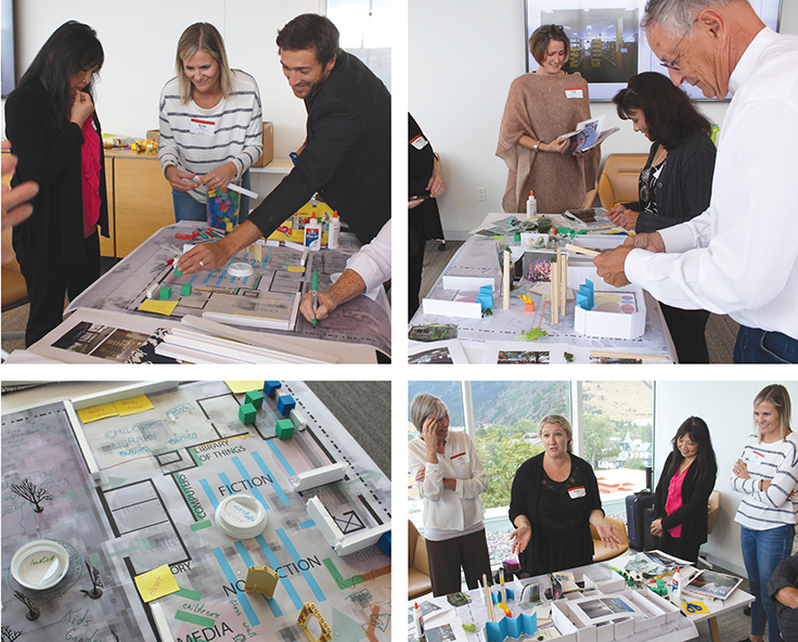
THE BRAINSTORM The group went through two exercises, focusing on changes to the current interior and how to incorporate the adjacent annex. Ideas for the main library’s remodel included removing interior walls for better access, openness, and flexibility; installing a curved circulation desk in the center; moving to mobile stacks to better accommodate change; repositioning study rooms, offices, and storage; adding quiet seating and carrels; and replacing some PC stations with a laptop bar and checkout.
To link the main library to the annex, folding glass walls were suggested for the sides of the library and the annex that face each other. The alley between the two would become a plaza with public art installations, performance space, planters and water features, a bike tune-up station, strung lights, and market stalls or food trucks.
Ratio architects shared three concepts: Main Street, which would move city offices from the library’s second floor to the annex, and rehab the main building’s interior with an open staircase, skylights, etc.; The Link, which would renovate the annex to serve as a vibrant community center; and Piazza del Paese, which would convert the alley into a people-friendly plaza and reconfigure building entries to line up with one another. —Karl Olson
Lincoln County Public Library: Troy Library and Opportunity Center, MT
ARCHITECT oll & Tam Architects
THE CHALLENGE Serving an isolated, rural, and dispersed population of 19,440, the library aims to pool resources with 19 partner organizations to address community risk factors including substance abuse, a need for human connectivity, poverty, and access to quality mental health care. Currently 1,768 square feet, the project will increase to at least 4,268 via the acquistion of an adjacent ambulance barn. There is community appetite for programming, specialized spaces like a community kitchen, and job service classes. The library sits on a superfund site, so remediation of contamination and asbestos will be necessary. The County Commissioners support the project but will not raise taxes to fund the anticipated $4 million cost. The project has secured grant funding and plans a major capital campaign.
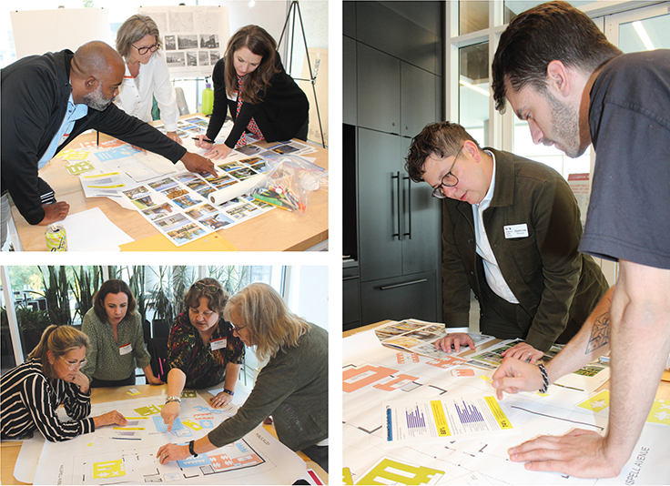
THE BRAINSTORM Architects Chris Noll and Jane Catalano asked groups of attendees to prioritize spaces and think about adjacencies, using large format drawings, floor plans, and materials to create bubble plans and vision boards.
The first group’s concept, Lifted Library, prioritized ADA accessibility, raising the foundation of one building and using modular furniture to create flexible spaces. The second, Community Bridge, featured a welcoming entrance combining the structures and focused on layering shared spaces including a modular community kitchen, maker space, and meeting room furniture in the former ambulance barn turned community room. They added a partner space with its own entrance, a coffee nook, and a transitional space for kids to play adjacent to a parent area, plus office space for staff. The third, Recreate, Create, Connect, added a glass connection between the structures and created an outdoor space and sensory area for children and an intergenerational library space. They connected the circulation desk to a staff office, added a flexible community room, and suggested a quiet area with a fireplace. —Slaven Lee
Owatonna Public Library, MN
ARCHITECT OPN Architects
THE CHALLENGE With a start date and 100 percent funding in hand for a renovation and expansion, the library seeks to change the perception of what the library can be for the community by reimaging the 1992 addition and original 1901 building with improved circulation, less cavernous shelving with better sightlines, a makerspace, and an overall reconceived layout for collections, staff functions, programming, and meeting spaces. A projected expansion from 4,000 to 6,500 square feet can better support the 30,000 residents, industrial partners, and the region. One challenge is to convince some community members that the function of the library is not only to house books but to serve the learning and skills-building goals of the community.
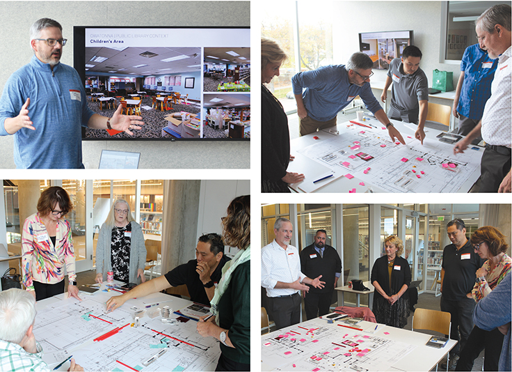
THE BRAINSTORM Mark Blando, library director, explained the problems the staff and community face in the current building configuration. OPN Architects explained the floor plan and tools available. Then participants dug in, asking questions of Blando. The answers lead to a complete redesign of the first two floors, starting with a welcoming “New Materials” display as patrons enter. A circulation pod can replace the massive circulation desk which blocks the flow of traffic, allowing better sightlines and more flexibility for users. Dual purpose space for staff will let them be available when needed. The youth collection will be weeded, so it can be housed on lower shelving in a smaller footprint. The YA patrons use the entire library and their collection can be intershelved with adult collections. Desktop computers will be removed in favor of alternate self-powered furniture for more private and inviting patron spaces. Moving the elevator to the outside wall will make the space flow and have better sightlines. Adding a materials handling system, DVD dispenser, holds pickup lockers, and laptop vending machines will free space to create a makerspace and expanded programming areas and give patrons more privacy in their collection choices. Family restrooms and comfort rooms will be added. Study spaces will be created using furniture, not walls, so the library can ebb and flow as needs change. —Honore Bray
Sweet Home Public Library, OR
ARCHITECT MSR Design
THE CHALLENGE The library seeks to offer a right-sized building that reflects both the future and the timber industry heritage of the area. The 10,000-strong town has outgrown its current 1969 building. With $1 million from donations and a local bond, the library seeks to expand from 5,757 square feet to around 14,000 and to create a building that supports distinct teen and children’s spaces for programming; offers an open, welcoming, and modern space for the community; and possibly shares space with the Chamber of Commerce, local community college, or low income housing for older adults.
THE BRAINSTORM Director Megan Dazey explained that many locals don’t have high school diplomas. They’re used to going into logging without needing one, but that’s less viable as the industry changes. The community also suffers from lack of internet access, owing to location as much as money. She outlined the library’s goals: find effective partners and choose among several sites.
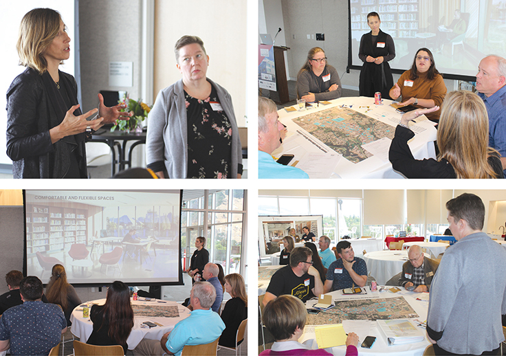
The MSR team split attendees into three groups, after sharing similar-sized case studies. Among suggestions from participants: offer Career Online High School; look into COVID and grant funding for telehealth; and bring in fiber and become a local broadband provider, with Wi-Fi hotspot lending for those too far out.
Partner suggestions included the community college, a teen pregnancy center, a new pharmacy and/or coffee shop, senior housing, a daycare, the farmers market, and for local timber employers to seek workforce development grants and become a training center. Attendees noted that partners don’t have to have money if they would attract additional supporters for government funding. For site selection, a privately held lot between the two main streets was favored, with closing a street to connect the library’s current site to the abandoned city hall a second choice. —Meredith Schwartz
Yolo County Law Library Woodland, CA
ARCHITECT Johnston Architects
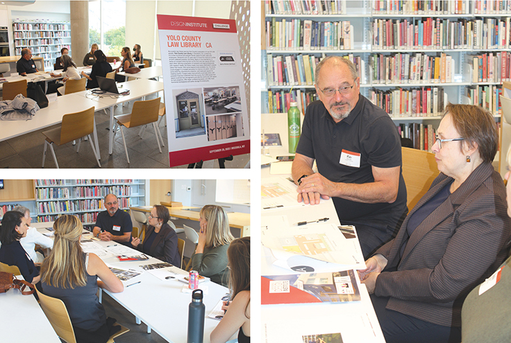
THE CHALLENGE Serving Yolo County’s population of over 221,000, the 2,099 square foot public law library is dreaming of a more functional and people-friendly space for users and employees. Designed over 20 years ago to house the maximum number of print materials possible, the space is now bisected by 14 banks of compact shelving that cut the front and rear off from each other. Serving the research needs of residents and legal professionals, the library needs more space dedicated to people rather than materials.
THE BRAINSTORM Because the library serves a diverse constituency of legal professionals and individuals researching their own legal needs, access to varying levels of privacy is a must. Mona Johnston Zellers of Johnston Architects led participants through a discussion of the needs of the community and opportunities to reimagine the layout, including expansion into an exterior courtyard. The library sits on a lot that is mostly fenced in, making the space opaque and foreboding. Currently many individuals come into the space, find the resources they need, and leave quickly, but they have expressed an interest in holding meetings, workshops, and depositions there.
Participants discussed adding soundproof booths with future flexibility to move them if needs change. Zellers improvised a rubric to help the library prioritize what options were most compelling based on cost, impact, efficiency, and viability. Ideas shared included creating a small training room, adding a welcome desk, vastly decreasing the collection size and offering it on smaller shelving, and increasing the natural light in the building by removing some walls and adding glass to make the space more inviting and visible. —Emily Petty Puckett
All photos by Kevin Henegan
RELATED
ALREADY A SUBSCRIBER? LOG IN
We are currently offering this content for free. Sign up now to activate your personal profile, where you can save articles for future viewing




Add Comment :-
Comment Policy:
Comment should not be empty !!!