6 Design Challenges from Austin | Design Institute Austin
William P. Faust Public Library, MI
ARCHITECT Tappé Architects
THE CHALLENGE In Westland, MI, the Faust Library is the community hub and provides activities for all ages. Designed by TMP Associates, its 25,400 net square feet were modeled on the Carnegie libraries of the early 1900s, with their grand halls and fireplaces. After 25 years, it needs to transform a cathedral-like interior with acoustical issues into a flexible, functional, and modern destination.
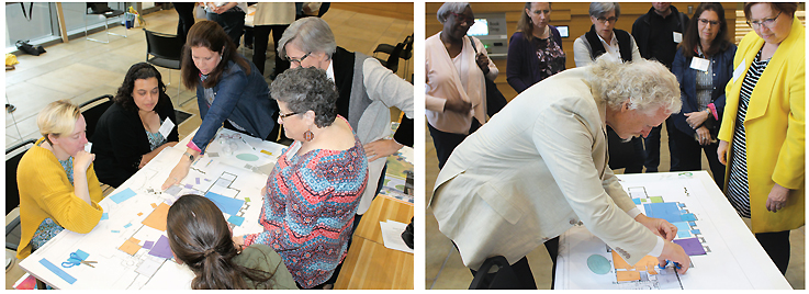
THE BRAINSTORM After a brief slideshow to introduce the challenge and list opportunities for change, Tappé’s Jeff Hoover tasked participants to “think inside the box.” Facilitated by Caryn Bartone and Jennifer Roth, heads of youth and adult services, respectively, the participants divided into two teams and used colorful blocks of paper representing areas of the library to renovate the entire interior. Both teams moved the children’s section to an area with lower ceilings and away from quiet zones. One relocated the staff adjacent to the teen room. This decision served two purposes: staff could use the teen space when it is not in use and monitor the teens when it is. Some decisions were easy, such as moving the quiet reading area near the fireplace to create a “living room.” Others were more difficult: where to locate staff areas, and whether to put new books, holds, and other convenience items close to the entrance. One team consolidated the information, reference, and circulation desks into a single connection point. The other added a larger service desk and a family restroom to the children’s area. The Faust Library is blessed with good bones, ample space, and vast windows. Both teams redesigned the interior to take advantage of the best features of the building.—Michelle Cervantes
Cedar Park Public Library, TX
ARCHITECT Noll & Tam Architects
THE CHALLENGE A rapidly growing suburb of Austin, Cedar Park passed a $20.5 million bond in 2015 for a new library in a new development adjacent to a park to replace the existing facility. The project has moved slowly—and has been downsized to 40,000 square feet owing to inflation, according to Director Julia Mitschke. Nevertheless, the library team has been garnering ideas to serve its young community: 55 percent of circulation is youth materials; the average age is 33. The team aims to supply more books, ebooks, and DVDs; much-needed space for individual and collaborative learning and programs; and expanded and improved wireless access.
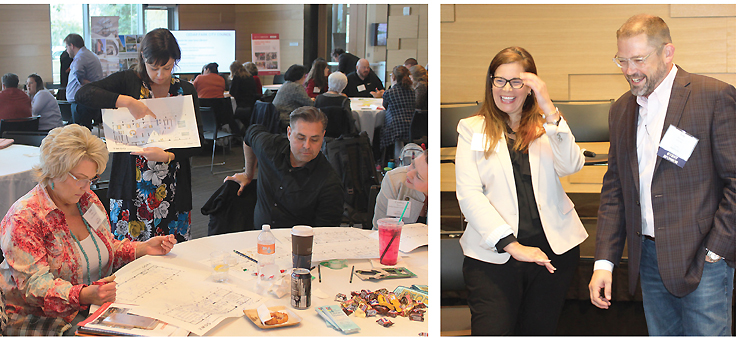
THE BRAINSTORM Noll & Tam architect Scott Salge walked the group through the design workflow: concept and schematic, design development, construction documents and approvals, construction, move-in, and grand opening. Then architect Trina Goodwin discussed the value of sharing data with your future users to guide design. This includes ages of users and types of spaces needed, e.g., gathering, work, programs, access, service, support, learning, discovery, and fun. Next, attendees broke into four groups, each representing a different “persona” family. What did the family require from the library, and how would the library deliver it: to a single mother whose son has ADHD; a family that runs a successful restaurant; a young family with a stay-at-home mother; and a retired couple whose grandkids visit. Overlap means the library must have flexible spaces that can accommodate networking, tutoring, studying, family services, small business help, multigenerational programs, outdoor play, low-cost entertainment, and food/relaxation. A guiding principle, said Goodwin, is to make sure the design represents both civic and community aspirations.—Rachel Nguyen
Liberty Hill Public Library, TX
ARCHITECT PGAL
THE CHALLENGE Thirty-five miles northwest of Austin, Liberty Hill, TX, is experiencing rapid residential growth with limited business growth. While the number of patrons keeps increasing, along with demands for services and materials, revenues are only slowly catching up. Maximizing every inch on a very limited budget is a priority for the new 6,000–10,000 square foot space that will replace the current 2,400 square foot building. The library team envisions a light and airy one-story, energy-efficient community hub, with plenty of space for seating, separate meeting and programming rooms, and dedicated office and staff workspace.
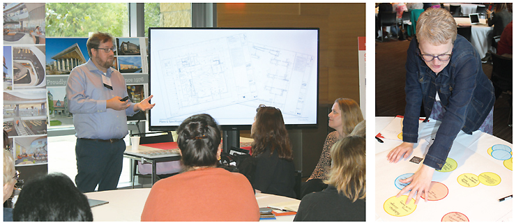
THE BRAINSTORM Elbow room is the number one priority, library director Angela Palmer told the group, since the current library has “less than two square feet per person.” A triangular acre and a half site, bounded by a walking path and an infrequently running steam train which could potentially have a stop, has been identified. Jeff Bulla of PGAL (below, l.) and his team outlined the needs for participants: an exterior, shaded event stage; a fireplace that’s tops on the staff wish list; and maximizing views of the adjacent sculpture park while avoiding western sun. Three teams were asked to arrange cutouts of library services into a functional layout that covered entrance location, separate spaces for kids and teens, and a special 900 square foot “special opportunity space” that each team got to designate based on local needs and priorities. While the layouts differed, the groups reached consensus on placing the large meeting room near the entrance, preserving trees on the site, and orienting the outdoor amphitheater to the train platform to double as a stage. Flexible spaces ran the gamut from a dedicated tween area to a café.—Meredith Schwartz
Lincoln City Library, NE
ARCHITECT Holzman Moss Bottino Architecture
THE CHALLENGE A new Central library for Lincoln, the state capital of Nebraska, has been on the table since 2003. The current administration seems amenable to putting a bond issue on the ballot, but the library team is already getting questions about how to lower the price—and expectations. The vision for the library includes more collaborative space, flexible tech areas, dynamic children’s and teen spaces, expansion of its robust programming, and preservation of special collections—a music library and Nebraska heritage author room. “How do we plan our new space and respond to tax sensitivity without diminishing the promise of an effective, sustainable, landmark building?” asked Director Pat Leach.
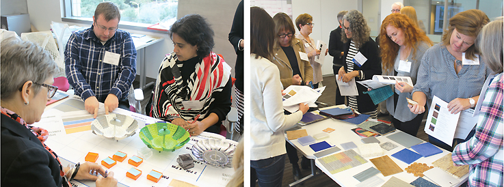
THE BRAINSTORM “Space is just where things happen,” said Nestor Bottino. “If these things are overlapping, cost can be reduced.” To that end, he and architect Amanda Rienth distributed steamer baskets, representing three different size spaces, to each of three groups, with the mandate to maximize space for performances, community events, programming, Making, and special collections. 10“Maybe you create big open spaces,” said Bottino. “A lot comes down to acoustics and how space is lit.” Group suggestions included Maker activities on mobile carts throughout the library, or teen Maker tech and a recording studio in the music library; an atrium for art, lectures, etc.; and retractable bleachers for a multipurpose auditorium. In the second part of the breakout, the groups selected new, durable materials for floors, ceilings, and walls, taking into account maximum efficiency and long use. Key concerns included noise abatement and “What can the kids do to this?” Xorel, which can be used on walls, panels, and furniture, drew a lot of support.—Francine Fialkoff
Riverdale Branch Library, FL
ARCHITECT VMDO
THE CHALLENGE Located in Ft. Myers in the Lee County Library System, Riverdale library was originally constructed as a strip mall for three tenants. Its storefront windows and doors span a rectangular 7,250 square feet. The goal for this remodel is to modernize the look and provide space that meets the needs of all ages, including lower shelving; nontraditional service points to free up space for programming, collaboration, individual study, and public forums; and a place for human services staff to work several days a week offering counseling, flu shots, and more.
THE BRAINSTORM After Lee County Manager of Internal Services Jill Horrom explained the challenge, VMDO’s Jim Kovach invited participants to create their own vision of the modernized branch. He gave each multiple large printouts of a clean floor plan, on which they could draw or place cutout elements including shelving, seating, service desks, staff area, etc. To make the best use of the long space, participants suggested flexible furniture on casters, bistro seating along walls, power outlets throughout, and creative use of shelving as space dividers. Other recommendations included creating small meeting rooms, lowering shelving and exposing the ceiling to improve the line of vision, adding plants and art, and placing seating next to windows to take advantage of natural light. Kovach offered four distinctive solutions featuring, among other things, a combined reference and circulation desk, skylights, pods of lower shelving, designated teen and children’s areas, an expanded large meeting room, a covered entrance with seating, and soundproofing options. Both the architect and participants’ plans overlapped in redesigning the large meeting room to allow after-hours access.—Irena Klaic

Zula B. Wylie Public Library, TX
ARCHITECT HBM Architects
THE CHALLENGE After the passage of a bond issue in November 2017, the Zula B. Wylie Public Library leadership team began planning a new 50,000 square foot community library to replace the current 10,000 square foot facility. Among their priorities are defined spaces for different age groups (including a growing senior population), increased programming, quiet reading and study spaces, and an outdoor classroom. According to library operations coordinator Theresa Brooks, multiple planning challenges include how best to position the library on the site to take advantage of views of the adjacent parkland and creek, and how to incorporate the parkland into the design.
THE BRAINSTORM Architects Peter Bolek and Kevin Kennedy divided attendees into three groups, provided a large geographic footprint and a variety of design shapes, and tasked the groups with laying out the building, park, and parking on the site. Other exercises considered the configuration of the two-story building and the incorporation of flexible space layouts. A key decision was how best to take advantage of the views afforded. All groups placed the library above the creek, located the main entrance facing the creek area and parkland, and included a usable outdoor space. For the interior of the two-story building, participants focused on contiguous spaces to control noise. They placed seniors at one end of the building, with teen and children’s spaces near each other. They located staff support spaces in the middle of the library and proposed a potentially larger first floor public service space.—Julie Todaro
All Photos by Kevin Henegan
See more coverage of LJ's Design Institutes and our Colorado Springs event.
RELATED
ALREADY A SUBSCRIBER? LOG IN
We are currently offering this content for free. Sign up now to activate your personal profile, where you can save articles for future viewing





Add Comment :-
Comment Policy:
Comment should not be empty !!!