Calgary Rises
The newly completed Central Library in Calgary, Alta., Canada, is designed by world-renowned architecture firms Snøhetta and Canadian-based DIALOG to make patrons feel welcomed and smart. Its construction provided a “catalyst and a structure for innovation” for the whole organization, using a design-thinking approach.
The city’s new Central Library is designed to make patrons feel welcomed and smart
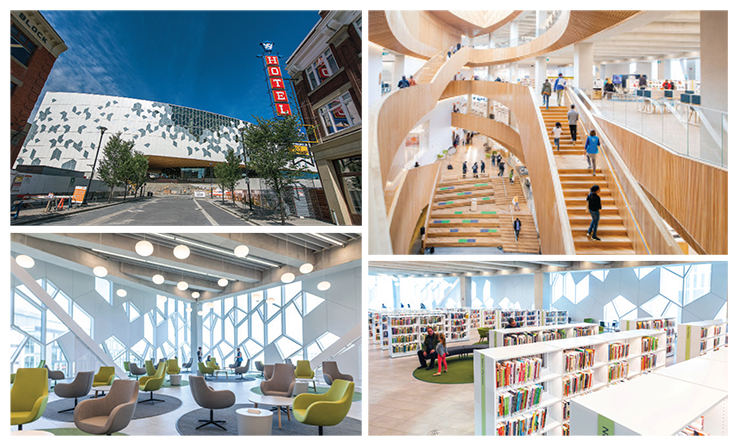
The newly completed Central Library in Calgary, Alta., designed by world-renowned architecture firms Snøhetta and Canadian-based DIALOG, is one of 2018’s most anticipated new libraries. Surrounded on all sides by buildings of various eras, at 240,000 square feet (up from 165,000), the library stands out from the crowd, with its modulated white curtain wall of geometric windows spanning the entire façade. A large-scale western red cedar archway draws visitors in and through to the other side. The library serves as a literal bridge across the city, connecting the revitalized East Village neighborhood to City Hall and new investments such as the National Music Centre.
The white angularity of the building envelope and the cool, hard texture of the concrete are softened by simple, natural millwork around the interior perimeter, including walls and, in some areas, the ceiling. On some levels, gray baffles are barely visible within the ribs of the ceiling, controlling sound on the open floors. While some furniture is custom-made, including some shelving, much was purchased with accessibility, durability, and welcoming comfort in mind.
The materials are not precious in themselves, but they were designed and installed with precision and attention to detail, as well as to sustainability: the project is targeting LEED Canada Gold certification. This pride of craftsmanship is evident everywhere, even in the public restroom tile work that offers a pop of saturated, cheerful color. For Calgary Public Library (CPL) CEO Bill Ptacek, details such as millwork and concrete pouring make this building outstanding.
|
COMMUNITY CATALYST (clockwise, from top l.): The building envelope, inspired by the image of connected houses in community; a playful open stair features lit and heated handrails to make the large space cozy; white shelves include built-in LED lighting and stay under six feet for clear sight lines; wide-ranging views from the Simmons-Harvie Community Living Room, located in the Prow, where the building comes to a point.Exterior photo by George Webber; all other photos by Neil Zeller. |
OPPORTUNITY FOR INNOVATION
In 2014, as construction of the new $245 million (Canadian) facility was under way, library leadership embarked on a systemwide reorganization of its staff and services. To Ptacek, who arrived that same year, the opportunity to create a new central library wasn’t just about getting a new building. It provided a “catalyst and a structure for innovation” for the whole organization. The library also hired experts from adjacent fields such as early education and museums to assist in designing new services. Using a design-thinking approach, more than 80 programs were conceived, with staff testing and experimenting with these new services in the branches and the original Main. By trying out lighting in shelving, for example, staff came up with the LED design solution.
This systematic and organizational strategy, “founded on designing great and impactful experiences, part of the ‘DNA’ of the library,” says Ptacek, shows great promise to catalyze the field.
A SNEAK PEEK
Just two days after staff received the keys on September 14, and more than a month before the library was scheduled to open to the public, attendees of the seventh annual Designing Libraries for the 21st Century conference, September 16–18, had the chance to tour the building. Following that, LJ talked to Sarah Meilleur, director of service delivery for CPL, and Ptacek about aspects they’re most excited about sharing with their community and the world.
The tour group entered through the loading dock and went via elevator up to the third floor. Protective plastic draped the chairs and tables; no books or materials were yet on the shelves. In the computer labs, desktops displayed the vibrant CPL logo, inviting visitors to “Wonder,” “Seek,” “Discover,” and “Share.”
Walking through, we encountered the many intentional scales of the building. From the intimate and bright computer labs carpeted in deep blue to double-height reading areas sharing sweeping views of the city through the pixelated and modular curtain wall. In the reading area, an art installation designed by Christian Moeller and built with 10,000 books features a much-larger-than-life goldfish. The shelves are bright white and make use of crisp LED lighting to showcase their contents. No bookshelf is over six feet tall, providing sight lines across the spaces and further reinforcing a human-scale within the large, mostly open area.
The building’s envelope is one of Meilleur’s favorite features. “One of the inspiration images we used for the curtain wall was that of houses connected together in community.” This concept became a central design element. It shapes both the intimate and the sweeping views that inspire as well as aid in orientation. It also influenced the wooden wayfinding signage and the logo. (Conference attendees weren’t the only ones permitted to get an early look at the building; see “Just the Ticket.”)
STARE-WORTHY STAIRS
The main staircase, angularly almond in shape, reflects the building’s overall form. Both the building and the stairs purposefully echo ancient Greco-Roman oil lamps, symbolically connecting ancient Western explorations of culture to our 21st-century experiences.
A large oculus skylight provides natural light that penetrates much of the building. This skylight (pictured on the cover) amplifies the warmth of the blond wood that forms the main staircase and many of the panels and ceiling drop-downs. Meilleur recounted an episode during construction when snow slid from the skylight, revealing blue sky above. “When you stand [in the gallery] and look up, you see the natural light, the beautiful millwork framing it,” she says. “It changes the feeling of the space minute by minute, hour by hour.”
Handrails feature small metal bumps at landings to indicate a change in the width of the tread. On the floor, raised metal bumps further communicate to visitors where they are. “I love the little details of the handrails. They are lit and are also [heated]. Using the handrails can warm you up on a cold day, creating an inviting and cozy experience even in a large space,” Ptacek says. From the gallery on the first floor looking upward, the staircase forms ribbons of wood that draw the eye up and through the building and encourage use.
|
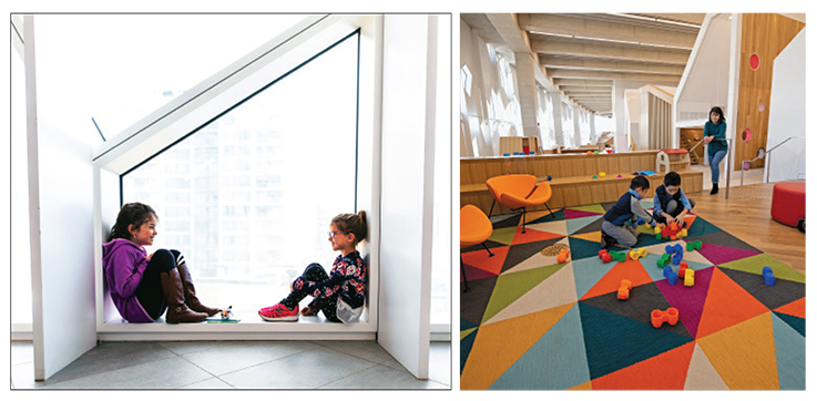
LEARNING TO PLAY (l.–r): Reading nooks are part of the rigorously researched, “full-body experience” early learning center; the children’s space is designed with not only kids but caregivers and siblings in mind.Photos by Neil Zeller. |
SILENCE AS A SERVICE
At the top of the building is the TD Great Reading Room, enveloped in wood paneling and housing built-in shelves and a central ceiling light that bathes the space. Thin, black built-in lights illuminate the reading desks, paired with simple wooden chairs. In this room, Meilleur tells LJ, “silence is a service, where contemplation is valued.” The room honors the written word, with quotes and vignettes that reinforce the power of literacy and intellectual curiosity. Wrapped in a vertical wooded lattice creating a cocooned effect, it is distinct from all other places in the building. Built-in benches along the hallways that frame the room offer intimate, serendipitous opportunities for rest, reflection, and connection.
The city’s public transit light rail (LRT) runs below the building, offering a formidable engineering challenge, and the track dictates the spine and curvature of the entire facility. The LRT part of the project, overseen by local engineering firm Entuitive, encapsulated 150 meters of track and took 18 months, 40,000 labor hours, 2,500 cubic meters of concrete, and 420 metric tons of rebar! According to CPL director of communications Mary Kapusta, for 99 percent of that time the trains were running full services.
But here, too, silence is a service. The library and the train have separate underground foundations to prevent vibration transfer to the building, and the building’s concrete slabs are suspended on hard rubber isolation pads so vibration that does make it through won’t shake the floors. Double-wall enclosures were used for rooms adjacent to the LRT. According to Meilleur, the challenge turned into a transformative design moment. “We saw the LRT line as an opportunity to help shape and form the building [into] something unique. Starting from this place is something we reflect on often, and [it reminds us that] constraint can create something more amazing than it would have been otherwise.”
THE LIVING ROOM REDEFINED
The inspiration train doesn’t stop with the shape of the space. The Library Express, a series of platforms extending from the main stairwell that bring visitors through the space, feature intentional and dynamic curated programs. It is intended to be fun and loud, the place where the design-thinking approach based on empathy and for different experiences most visibly translates to the built environment. “Before you even start designing, you build empathy with the people you are trying to build for. Our hope is that we’ll continue to get better at connecting with our community,” says Ptacek.
“We created a plan for unique and innovative programs and services that would play out in different spaces, at different levels [of the building], noise level, audiences, and time frames, for example short or long dwell times,” Meilleur adds. “These were the programs we tested and trialed at different locations to make sure that [when we opened the new Central Library] we would have a great visitor experience.” Typewriters will be available to adults to encourage creation and engagement with the written word; “book candy,” curated collections of materials (including recommended reads by prominent Calgarians and Canadians), will rotate through the space.
None of these areas are expansive, but all are visually and physically connected, and each features unique built-in seating and pops of color delivered via the flooring and furniture. Offset from the center, the Library Express platforms follow the curvature of the building and offer an increasingly open view of the city landscape as one moves through. A gently sloping ramp next to the platforms offers an accessible alternative to the small sets of stairs within the platforms and contained by built-in seating or shelving. This application takes the “living room” concept to a whole new level, literally.
A FULL-BODY EXPERIENCE
A full-body play Early Learning Centre encompasses a fully immersive built environment, inviting children two to six years old to grab a book and crawl into a quiet nook, climb or bounce through a playground-like structure, or use activity tables. It’s designed with both children and caregivers or accompanying siblings in mind.
While ten other CPL locations have early learning centers, this one aims to be the culminating experience based on four years of research and testing by developing relationships with schools and child-care centers citywide to learn about their practices, needs, and goals. This investment is part of an aspirational goal Ptacek and his staff have: to make Calgary the most literate city in North America by connecting with and positively impacting the 90,000 Calgarians under age five.
HONORING COMMUNITIES
The library recognizes its connection to the Indigenous communities it serves, its site on ancient spiritual grounds, and the role it can play to foster and support community expression by Indigenous citizens. Its staff partnered with the Indigenous Place Making Council of Canada during the design and over the course of the project, illustrating the importance of designing for multiple experiences and a variety of communities. Views from the building look out onto recognized sacred lands; the library will host smudging ceremonies as well as an Indigenous artist through its residency program.
HIGH PERFORMANCE
With one solid curtain wall facing the street, the 330-plus-seat Performance Hall serves as a beacon to the street and the rest of the city. The seats, nearly half of the total offered in the old library, are only a fraction of the new one’s 1,925. The sunken space features blue-toned ombré fabric on the theater-style seating, leading down to a large-format stage and screen. It can be accessed from two sides of the building and is designed primarily for community-driven programming. According to Meilleur, it helps “set the tone” for the library and those experiencing it.
PLACEMAKING FOR A CITY
As we concluded the tour, our guide told us that everyone aims for the new Central Library to be a place where people “feel welcome and smart,” echoing sentiments expressed by both Ptacek and Meilleur. Central will provide room for reflection, activity, investigation, and connection.
It plays expertly on scale and offers spaces that are alternately awe inspiring and intimate. “The building is a palette, the library is the facilitator, and the partners will be the ones providing the great experience,” Ptacek explains. “This building is an investment the city made in the potential of the people who live here. It’s not about a pretty place to hang out but [being a place] where people get access to free and open ideas, information, and culture. All these are things that can make their lives better, can allow them to participate in and improve their communities.”
Emily Puckett Rodgers is Space Design and Assessment Librarian and head of the Library Environments department, University of Michigan Library, Ann Arbor. Her department designs strategic space investments and processes, manages wayfinding, and conducts service and user-focused research about how buildings, collections, and services are used to inform physical design decisions across library buildings.
Just the Ticket
On Saturday, October 27, four days before the scheduled November 1 opening of the Calgary Public Library (CPL) Central Library, 100 lucky residents got a chance to tour the building before their neighbors. Taking a leaf from Roald Dahl’s Charlie and the Chocolate Factory and its protagonist Willy Wonka, the library chose its special visitors through a Golden Tickets Giveaway scavenger hunt from September 4–30.
Instead of embedding them beneath the wrappings of chocolate bars, as Wonka did, CPL hid them throughout the system’s 20 branches, in indoor spaces accessible to the public, or awarded by one of the library’s partner  organizations: East Village, CPL Foundation, Office of the Mayor, YMCA, Wordfest, Studio Bell, Beakerhead, or YW. Winners had to be library members (cardholders) to claim their prize and could bring one guest—or the members of their immediate family. All told, that meant 400 people on-site to enjoy free programming, ice cream, tours, and a gift bag for the ticket-holders.
To keep up the excitement in the run-up and to ensure dedicated searchers knew where to focus, the library updated a map each time a branch reported that all its tickets had been discovered. All 100 were claimed, and staff were empowered not only to register ticket finders as new cardholders so they could claim their tour but to forgive late fees for finders so their cards were active, according to Mary Kapusta, CPL’s director of communications. And it wasn’t just ticket seekers who signed up: the library garnered over 12,000 new members in September, 13 percent more than in September 2017.
The cost of the promotion was very low, making it replicable for libraries of all sizes and budgets. Says Kapusta, “As a model, it was hugely successful, spoke directly to our membership, and our staff were its biggest champions!” It gained additional press attention in the prelaunch as well as increasing patron sense of ownership and involvement in the new Central. Sarah Meilleur, CPL director, service delivery, told Global News, “We were inspired by this sense of quest. Willie Wonka’s chocolate factory is a place of imagination, and the new library’s going to be that for everyone, too. It has a bit of that sense of magic to it.” Apparently the public agrees. Says Kapusta, “One mother thanked us for giving her daughter the memory of her childhood.”—Meredith Schwartz
RELATED
ALREADY A SUBSCRIBER? LOG IN
We are currently offering this content for free. Sign up now to activate your personal profile, where you can save articles for future viewing


Add Comment :-
Comment Policy:
Comment should not be empty !!!