Catalog by Design | The User Experience
Aside from paying very little attention to visual design and not caring about the impact of horrible typography, the big problem with library catalogs is that they are not designed to help people accomplish library tasks. Instead, they’re designed to expose catalog records.
I’m not even talking about lofty library tasks like learning, creating, and connecting. I’m not referring to semi-interesting library tasks like discovering exciting content. I’m talking about very basic library tasks: finding items in a specific location, reserving items, and renewing items. Of course, people can do these tasks with our catalogs but only because the functionality has been clumsily bolted onto catalog records.
Correct me if I’m wrong, but this is totally backward—prioritizing the collection, not people, results in a user-hostile interaction design and a poor user experience.
Imagine the reverse: a tool that prioritizes helping people accomplish their tasks, whereby bibliographic data exists quietly in the background and is exposed only when useful.
Starting from design
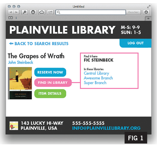
I wondered what this would look like, so I sketched out some examples. I’m certainly not the first to complain about OPAC functionality, but taking this as an explicit design challenge rather than as a software architecture or cataloging challenge led me to emphasize readability and ease of use.
Beyond that, there isn’t too much to explain about these designs. Figure 1 is a very plain bibliographic record and illustrates how simplifying them would make them easier to use.
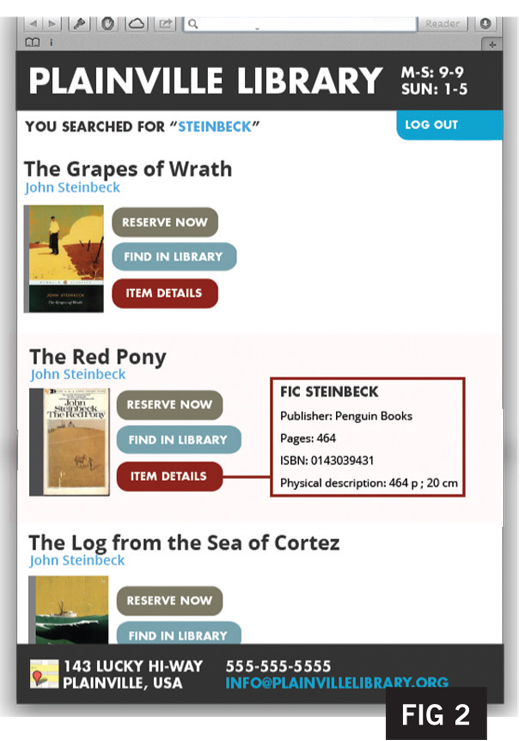
Figure 2 hints at eliminating the need for a dedicated view of a single bibliographic record; in this mock-up, nearly everything a member needs to do with an item is available without it.
(The ability to link directly to a single record is missing from this example, but that would be easy enough to sort out.) Figure 3 is similar but uses a swipe-friendly layout that could be effective on mobile devices.
An effective catalog design would obviate the need for how-to screencasts and handouts. Designs like this would not only make our libraries easier to use, but, by freeing up the time we spend helping people with our catalogs, they would make librarians’ lives easier, too.
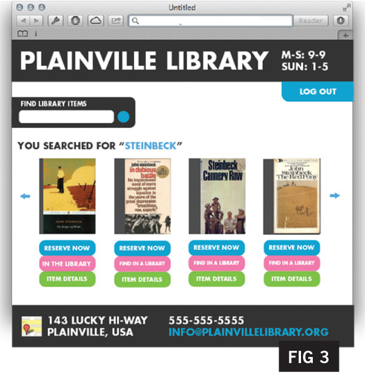
While these examples aren’t fully featured, they illustrate how focusing on people and tasks would change our catalog. When bibliographic data plays second fiddle, the page calms down and is easier to understand and use. What’s more, by employing some basic principles of graphic design, these creations instill more confidence in library services than our current catalogs.
Members in mind
This is just one example of how focusing on our members’ motivations and goals can transform what we do. Members will be better served if all of our services are designed as responses to their motivations and goals. With regard to catalogs, this focal point leads to improvements in usability. For library services, this emphasis makes libraries more worthwhile.
The deeper libraries dive into the lives of their members and explore opportunities for improving their lives, the more impact we can make and the more valuable libraries will become. This sort of listening, not shouting, is the best form of library advocacy.
RELATED
ALREADY A SUBSCRIBER? LOG IN
We are currently offering this content for free. Sign up now to activate your personal profile, where you can save articles for future viewing






Add Comment :-
Comment Policy:
Comment should not be empty !!!
Elisabet Fornell
Stumbled across this posting today: our Stockholm library site (Sweden) is trying to have a different approach for instance https://biblioteket.stockholm.se/en/titel/451695 I see some problems here in the English version, but you get the ideaPosted : Mar 11, 2013 10:35
John Myers
I like this! As a cataloger, I have been wrestling with ever increasing divergence between the card mindset of our interfaces and the new presentation models I see in commercial online catalogs. With cards, a catalog user was presented with all the information. We carried this forward in our online catalogs. As expert users, we are trained to rapidly scan and filter for the pertinent details. But does our public see the visual equivalent of “bwah, bwah, bwah, bwaaah” (aka Peanuts cartoon teacher talk)? Yes, the situation is more complex than presented here. Even a known item search could result in multiple hits for different editions and formats. Subject and keyword explorations would likely be even more complicated. Is the clear simplicity of these mock ups scalable to address the additional complexity? Drilling down through layers of detail, btw, incorporates exactly the kind of structure and tasks laid out in the FRBR report.Posted : Feb 14, 2013 12:59
ricklibrarian
I like this idea for a public library. So many times the client only wants the location and whether it is on shelf. Many would appreciate that (when possible) in the first result.Posted : Feb 13, 2013 03:33
Pam
Aaron, I admire your endeavor to improve the library user experience. I've been managing libraries for 5 years now, and even back in grad school I was disappointed in the friendliness (or lack thereof) of OPACs and databases. They are built for power users, not the average (or even below average) user. I used to think librarianship was full of collaboration, but I am reminded of how territorial, defensive, and dismissive the field can be. We need to pull together, collaboratively, to make the entire experience and acquisition of knowledge a welcoming one. Welcoming both to users who may not be as "information literate," but also to those of us brave enough to champion change.Posted : Feb 11, 2013 10:59
Barbara
In an academic library, I think we need two things - good results for a subject search (which is a pretty typical entry point for undergrads) and the ability to search for a specific title (which is more typically how faculty search). This means the ability to go straight to one title and a "did you mean" suggestion for closely related titles if you got a word wrong, plus an invisible "did you mean" subject authority system that takes common phrases or misspelled words students type in which links them to the subject headings they wouldn't have thought of. This means good system design and great cataloging. The visual representation of elements on the screen is important, but only if there's good metadata to work with in the first place. I think we've paid too much attention to display and not enough to the human work of cataloging.Posted : Feb 08, 2013 06:41
Cecily Walker
I think many catalogue discover layers are getting better at this. My library is a Bibliocommons library and - speaking only for myself of course - it offers many of these features already. Informally, our patrons have been very happy with it. The ones who weren't were on the outer edges of the Bell Curve and were looking for such specialized materials that they got more out of complex, advanced search features that existed in our previous OPAC. What was interesting to me as we went through our implementation was the split between what patrons wanted and needed from a catalogue (simplicity, known item, natural language searching) and what cataloguing staff felt was important (the ability to see detailed catalogue records, exposure for MARC fields, etc). I think what Aaron is suggesting, and what these vendors are starting to put forth, represents a gradual yet necessary shift in our perspective as information and service providers. Moving toward a customer-focused service model and making easier for people to search for, discover, and access our materials from that point of view seems to me to be mutually beneficial.Posted : Feb 08, 2013 09:56
David Smolen
We use Polaris and it does what the author is talking about. The initial results list is limited to the type of data he shows in his screenshots. You only see the full record by clicking on "show more." Polaris also has this nice, Amazon like, web portal that serves as the top page of the catalog. Patrons also have the ability to view a "Google Preview" of the book they are interested in.Posted : Feb 08, 2013 01:25
Katherine Marschall
I understand Mr. Schmidt is throwing out a general idea, but the problems with catalogs start with the search. His idea is pretty good, very clean and user friendly, but only after the patron has picked out the material he wants. Known item searching is a very important function, but hardly the only search that is needed. I work at a small college library, and our students need a discovery layer; they may not know a title or an author, rather they want to know what we have on a topic. And that topic can range from very specific, to very broad and diffuse. How does the catalog tell me which books, etc. might be helpful? How do I find more like this one? They may not need to see all the information in the record, but they need to see why something appeared on the results list, and what the material is actually about (summary, contents notes, subject headings).Posted : Feb 07, 2013 02:21
Christina
This isn't a bad representation of where catalogs shoud go on the user side at all. I would add one more tab of "similar" to this tab list. Avid readers are always looking for read alikes. And oh yeah stars for reviews and ratings..love reviews and ratings. Is it a part of a series? These are all things we as library people can determine what fields the patrons should and should not see. That's a library thing though and can be determined by releasing the priveledge or not. It's not a big deal in my view. It's streamlined and gives the user what they want upfront without hunting for it forever. On the backend there would still need to be traditional catalog functions as the OPAC serves a more intricate purpose on the staffing side. Patrons want simplicity and effcientcy...what is wrong with this method of delivery that look quite commercial ( yes we still compete with bookstores and have we forgotten Amazon) which makes the library look fresh and useable. Nobody likes a site that is difficult to navigate on the user end. I don't think Mr. Schmidt's idea is bad but given other factors and that it's not a dissertation or a part of a strategic plan or anything big like that this is a good starting point for discussion of what users see as useful and what we as Library folk need to see in the OPAC and how the competition drives thier users thru thier sites and gets returning users.Posted : Feb 07, 2013 01:23
Jeffrey Beall
The real world of knowledge organization is a lot more complicated than "The grapes of wrath" and "The red pony." Your solutions are simplistic, and you don't seem to understand all the different needs that different patrons have in different contexts and in different types of libraries. I also don't understand why you refer to library patrons as "members." It makes me wonder where you're coming from.I think your views are completely out of touch here.Posted : Feb 07, 2013 12:49
Michael Mitchell
Very tautological. "The problem with catalogs is that they are designed to be catalogs." I don't think stripping the catalog of all detail, as Mr. Schmidt seems to be suggesting, is an answer to anything including value-added user experiences. But then again I'm just a catalog librarian. And despite Mr. Schmidt's allegations, I do successfully design our records to help people accomplish library tasks.Posted : Feb 06, 2013 10:56