Consider the Checkout Slip | The User Experience
Call me crazy, but I think the secret life of checkout slips is fascinating.
Some moms use their foot-long slips filled with children’s books as a master list, crossing off items as they’re returned. One regular patron I knew kept every checkout slip she ever received. Upon returning items, she’d ask us to cross off the titles on the original slip and initial it. This behavior was the result of a typical “I returned that”/“Not according to our computers” interaction.
 And, of course, countless slips are used as bookmarks or refrigerator-mounted notices or simply left in dust jackets for weeks. However small, these slips are touchpoints—ways that people interact with us—and collectively we’re pumping out thousands of these things daily.
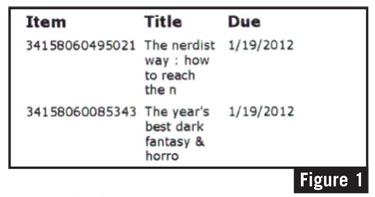
Likewise, in some small way, we’re representing ourselves through these little scraps of paper. Yet, most of us are churning out slips that could be easier on the eye and more helpful to our users (see Figure 1).
 This isn’t something to keep you up at night, but it’s still worth thinking about, because details matter. All of these little touchpoints add up to create people’s experience of our libraries. And dispensing ugly checkout receipts illustrates that we haven’t spent enough time sweating these details. Even worse, this inattention is at the root of complaints about hard-to-use websites and repeated questions about where the restrooms are.
What is a good checkout slip?
To answer this we have to know what a checkout slip is supposed to do. As I see it, there are a few core functions:
- remind people when items are due (patron need)
- remind people what items they have checked out (patron need)
- facilitate the return of materials (library need)
Beyond that, some slips have secondary functions:
- facilitate renewing items (patron need)
- promote library events (library need)
- broadcast policy changes (library need)
- alert people to holiday hour changes (patron need)
With these factors in mind, we can now think of some other factors surrounding the design of an ideal checkout slip:
- They should respect people’s privacy.
- They should include the library’s name and branding.
- They should be easy to read. This includes obeying graphic design basics as well as not cutting off item titles, etc. (See “Signs of Good Design,” LJ 2/1/11)
- Ideally, they’d show some personality and/or be friendly.
- Item types could be helpful to patrons trying to locate a misplaced item.
Checking out the fun
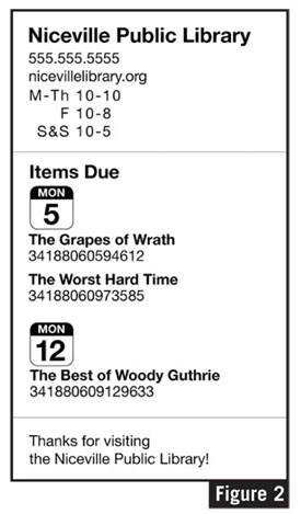
 After compiling the functions’ lists, I started to think about whether there was a way to make checkout slips more fun, or whether that was a terrible impulse. More seriously, I considered what would be the minimum amount of information required to make an item easily identifiable and other basic considerations, such as why there is a due date listed for each item when most items share a due date with others. With all of these things in mind, I took a crack at designing a checkout slip (see Figure 2).
There’s nothing very different about this design, but I reckon it is a bit easier to use when hanging on a refrigerator than the current crop. Aside from sensible typography, the only thing notable is that items are grouped by due date rather than listing a due date for each item.
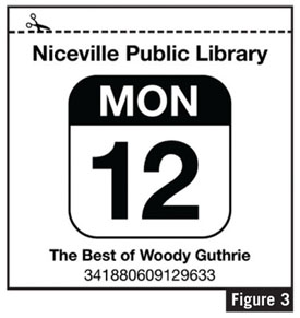
I really like the idea of a checkout slip that includes an extra bit that’s specifically meant to be displayed on a refrigerator or corkboard, though such a design could add about three or more inches of length per due date. It might be cumbersome, but consider how much better this communicates your library’s philosophy (see Figure 3).
Just remember: the details matter, especially when these checkout slips are the most visible output of your library that most users will see.
RELATED
ALREADY A SUBSCRIBER? LOG IN
We are currently offering this content for free. Sign up now to activate your personal profile, where you can save articles for future viewing





Add Comment :-
Comment Policy:
Comment should not be empty !!!
sylvie
FYI thatbob, there is an ILS that does just that (total the value of what you just checked out : today you saved : $xx.xx! I think it is Appollo from Biblionix ...Posted : May 22, 2012 12:39
Jason B.
This issue of the print magazine didn't cross my desk until this week (mid April 2012) but if anyone comes across this later or is still intersted, I believe the Evergreen ILS is capable of this. Receipts are templated with regular HTML and JavaScript customization is also possible (and is necessary to move them around.) We use Evergreen at the library where I work, so I'll definitely try this out to see if it's possible to re-layout like Fig 2; I like the iCal style date and layout a little more than what I came up with already. I'm sure Fig 3. is possible, but man is that a lot of paper. (Patrons are allowed up to 100 concurrent checkouts!)Posted : Apr 18, 2012 12:47
M. Bear
Pretty interesting. It would be cool to do a foursquare kind of thing, have a leader board of library visits and types of loans...just thinking out the box here.Posted : Feb 09, 2012 03:51
thatbob
I've been saying for years that the "Retail value" or "List price" of each item should be listed, along with a total "You saved $XXX.99 by using the library" at the bottom. First of all, it would educate the public to the cost of materials - people are always acting surprised when they lose a book and have to pay for it, or when they get to college and books cost more than $25 each. But more to the point, no library would ever face another funding cut if the cash value we provide were more up-in-your-face. When a typical mom checking out The Help and say 5 picture books and 2 DVDs sees that she just "saved" $160, presto. Hell, I'll go further and say that every household should get a bill in the mail at the end of the year saying you paid $70 in taxes to support the library, you borrowed $3,089 worth of materials, and you paid $22 in overdue fines, thanks for your support. The 35-50% of people who never use the library could receive a similar note, with the message that borrowing only 4 items per year would "pay for itself", but no pressure to do so, because the typical citizen uses the library most when they have kids, lose a job, or retire. Also, we boost your property values, and serve as commercial anchors for your retail strip, thank you, have a nice day. As for ILS vendors supporting customizable receipts, no, none of them do. This is why every library consortium and large library system should have a UI designer and a couple of open-source software developers on staff, which libraries could pay for custom work to an open source ILS, at a fraction of the cost that we pay to vendors for their inadequate products.Posted : Feb 08, 2012 10:22
George Needham
Does anyone use the back of the check out slip to sell advertising, the way grocery stores do? If you could have revenue from ads printed on the back of the slips, you may earn enough to pay for the slips and even have a little over to hire a free lancer to make the front look snazzier!Posted : Feb 08, 2012 06:26
Carole MacFarquhar
Interesting thoughts. I thought I would offer another idea as a library user (when I was a stay-at-home-mom) - another use for the transaction slips. I kept all of them as a record of what books my son had "read". Ours nicely provided title and author.Posted : Feb 08, 2012 04:19
tc
I agree that the layout of data on the receipt can certainly contribute to or diminish the usability of the receipt. Lets talk about how the receipt is used inside the library. You quote patrons using receipts as proof of transactions: “I returned that”/“Not according to our computers”. Shouldn't you be concerned that you are relying on a piece of paper as positive proof of "what happened"? Is your database so unreliable that you must rely on a piece of paper you have no control over, can be easily replicated or forged and is currently in no way secure or capable of being validated? If the system dispenses a receipt indicating some kind of transaction occurred, the ILS must have records of those transactions. Thus the receipt is only a nice convenience for the patron, but not proof of what transactions occurred.Posted : Feb 08, 2012 04:04
AGR
Yes, we can get custom messages on the bottom of the slip. However we can't control the formatting in any way that would improve the user experience. Aaron, if you're able to dig a little and find out more about how this could be implemented with the major ILSs, that would be awesome!Posted : Feb 08, 2012 02:47
Andy Woodworth
I made this similar discovery in my library system a couple of years back. We were able to get messages about programs onto the bottom of the checkout slips for big events that we wanted to push. Sadly, it had limitations including the only staff member who knew that ILS system well enough to fiddle with the bode retiring. Sadly, it has since been dropped. But I won't forget walking into the parking lot one day and listening to a woman who called a friend to tell her about an employment program "right here on the bottom of my slip". For any skeptics, this is totally doable and it works. It's just a matter of finding out how with your ILS system. Good luck!Posted : Feb 08, 2012 02:34
Aaron
Hi AGR - I don't know which ILS would make this the easiest. But I imagine that the data output could be gathered in a different database and transformed. Maybe I'll have to ping the Code4Lib folks about this.Posted : Feb 08, 2012 02:23
AGR
All great ideas, and I endorse them 100%, but can you specify which ILS systems offer that degree of customization in available in checkout slips? Our experience using one major ILS is that we can't even have different type sizes or styles (plain/bold/italic) for different fields, much less the cool calendar displays you show above.Posted : Feb 08, 2012 02:17
Joneser
Facilitating the return of materials is ALSO a patron need in that many libraries don't have the budget to replace these materials - thus, the patron will have less access. The materials may also may be time-sensitive (e.g. school assignments) and reordering takes up that time.Posted : Feb 07, 2012 11:46