2018 School Spending Survey Report
Inspiring Design | The User Experience
Need some design inspiration or encouragement? Here are some well-designed sites and services User Experience columnist Aaron Schmidt noticed recently in libraries.
By Aaron Schmidt
Need some design inspiration or encouragement? Here are some well-designed sites and services I’ve noticed recently in libraries.
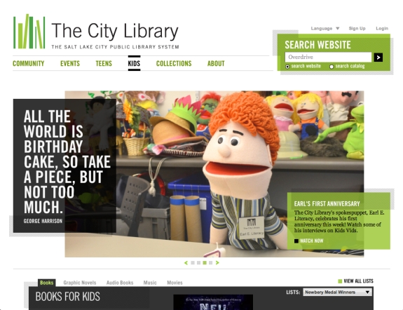 The Salt Lake City Public Library might have an unfriendly URL (www.slcpl.lib.ut.us—not sure why they don’t default to slcpl.org, or register and start using saltlakelibrary.org), but the site has a fresh and compelling visual design. It is one of the few library websites that makes me want to browse for fun. I have a hunch that the site might sacrifice some user testing for the (admittedly impressive) visual design, but I’d be interested to see the results of user testing.
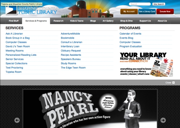 The Topeka & Shawnee County Public Library, KS, employs megamenus--a grouped listing of up to dozens of menu items--to aid patrons' discovery process. The menus appear as a big drop-down panel and reflect a site structure that is broad rather than deep. They mesh well with the site's attractive design, too.
 On a recent tour of libraries near Mexico City, I observed attractive, consistent signs throughout. They all use the same typeface and don't need supplementation with tacked-up printing paper. These signs are the product of a nationally centralized program.
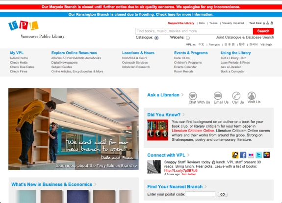 There's a lot to like about British Columbia's Vancouver Public Library website. Its emergency notifications at top are easy to see without trashing the site's design. I've long been a fan of the photographs of real patrons the library uses to highlight news and services--they humanize the site and make it engaging.
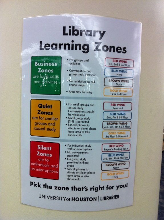 Creating zones for different behaviors is an effective way to manage patrons' expectations. Here's an attractive and effective zoning sign from the University of Houston's M.D. Anderson Library.
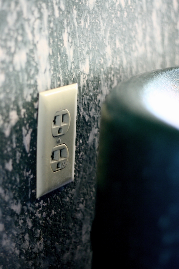 Okay, I'll sneak in one not-so-good practice. This power outlet is hidden behind a chair but people continue to use it. The arrangement isn't overly convenient for patrons and it is damaging the receptacle. It has the potential to break someone's plug and rip the hardware out of the wall. The lesson here isn't just about power outlets. Many aspects of our buildings and services can better serve people with only slight tweaks.
RELATED
RECOMMENDED
TECHNOLOGY
ALREADY A SUBSCRIBER? LOG IN
We are currently offering this content for free. Sign up now to activate your personal profile, where you can save articles for future viewing


Add Comment :-
Comment Policy:
Comment should not be empty !!!
david lee king
Hi Aaron - thanks for the mention in your article. Great user experiences are VERY important to us!Posted : Jan 07, 2012 07:08