Starting with Simplicity | The User Experience
 There are lots of ways to make life easier for the members of your library, but the simplest might be to step back and rethink your website.
In “The Benefits of Less,” I advocated for reducing the size of library websites. Doing so makes them easier for libraries to manage and, more important, easier for library members to use. I’m not the first to advocate content restraint, and I’m not the only one preaching this. Recently, Matthew Reidsma, web services librarian at Grand Valley State University, MI, wrote about cutting some 70 percent of the content from his library’s site and how no one noticed (matthew.reidsrow.com/articles/19). Writing about the fold on web pages—the parts of the screen users see when a page opens without scrolling down—Reidsma suggests an aggressive method for cutting content:
For now, here are some rules for dealing with content below the fold.
- Get rid of it.
- Go to rule 1.
This might be slightly simplistic, but it certainly has the right sentiment. Actually, wrangling content doesn’t have to be much more complicated than Reidsma’s suggestion. As always, the needs of library members should guide us as we make these decisions. Since library members the world over have similar library website needs, it’s possible to make some generalizations about what content library websites should have and how the sites should be designed.
To be sure, libraries must be responsive to their communities and offer individualized services, but typical web UX and design are not generally an area where libraries are going to innovate. Instead, better to benefit from the collective experience of other designers and focus limited resources on customization elsewhere. There are great efficiencies to be had if libraries were to join forces for website development efforts. It seems silly that libraries across the country are working alone, trying to solve the same problems.
Heading toward one page
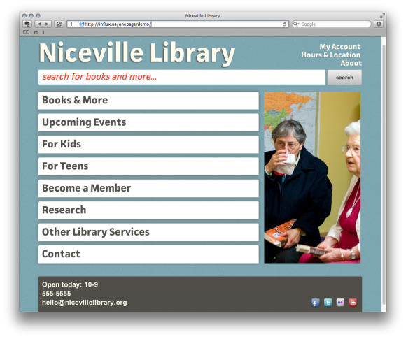
Collaborating on library website development doesn’t be complicated. As a proof of concept, my UX colleagues Nate Hill and Amanda Etches and I created a sample library website template to illustrate this (see figure above). It solves numerous common library website problems, and the result is a site that’s simple but better than most.
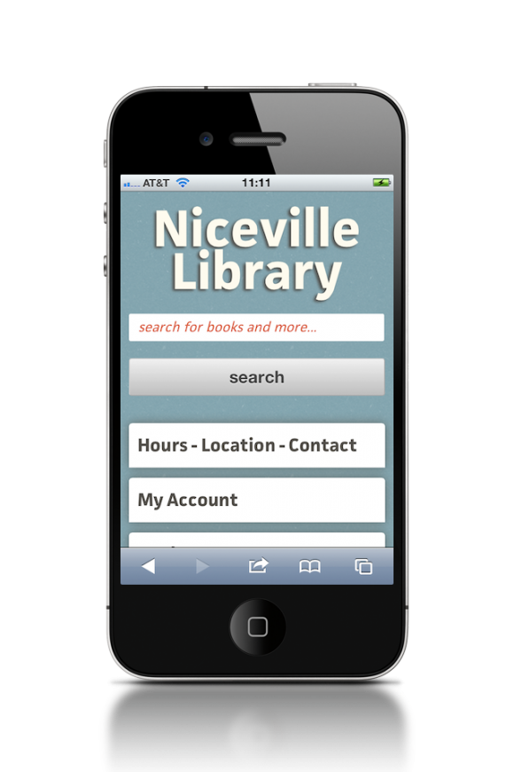
 Our example features plain writing, highly legible typography, the basic content people want on a library site, and nothing more. Additionally, the site is responsive, meaning that it adapts gracefully to all desktop and mobile browsers. This gives mobile users the most appropriate experience without requiring any extra work for librarians. This One-Pager template is free for libraries to use under a Creative Commons license so you can download the code and fill in your own content. For more details, visit influx.us/onepager, or try the demo at influx.us/onepagerdemo.
Nail the simple stuff
You’ll notice that there isn’t any interactivity built in to One-Pager. Some might consider this a limitation, but we think of it as a restriction leaning toward advantage. Advanced website features are worth pursuing only if they rest atop a solid foundation. The majority of library websites don’t meet basic standards of usability, appropriate writing, and graphic design. They lack this groundwork and should get the basics right before moving forward. Scaling back is a way to make this happen.
I’m not a strict reductionist and fully support libraries aiming toward the development of interesting, higher level aspects to their websites, such as Ann Arbor Library District’s Treasure Quest summer game, which offered clues and earnable points to participants online.
But we have to nail the design fundamentals first—and focusing on one great page for every library could be our most direct path to success.
RELATED
ALREADY A SUBSCRIBER? LOG IN
We are currently offering this content for free. Sign up now to activate your personal profile, where you can save articles for future viewing


Add Comment :-
Comment Policy:
Comment should not be empty !!!
Will
I find myself agreeing and disagreeing on various points here. Eliminating anything below the fold? Sure, on a library site's main page, absolutely! On subsequent pages? Definitely not. In terms of content, that is; navigation features should definitely stay above the fold (with the exception of the footer, of course, but on the main page your users will see it and assume--hopefully correctly--that they will find that footer at the bottom of all your other pages, yes?). Some libraries have much more content to offer than others--programs & events, collections, etc. I wouldn't recommend that such libraries "dumb down" their sites, content-wise, to whatever they think the lowest common denominator of their patron base might be able to suss out. On the other hand, I do believe that library web sites can be designed intelligently, and with patrons' most pressing needs in mind. Place the most critical navigation at the top-left and/or top of the page and go from there--in simple terms, you should basically be able to imagine a big arrow pointing down diagonally from the top-left of your page to the bottom-right (at least in Western cultures) as an indicator of decreasing importance. New and/or inexperienced Web users should therefore be able to find the most popular/relevant parts of your site first (catalog, site search, etc) without having to "figure it out". Subsequent visits, and/or use by more experienced users, will find that additional (but not as pressing) content deeper into your site. I agree that a solid foundation is critical. But I also believe that expanding upon that solid foundation is just as important, though perhaps more-so for those libraries that actually have the additional content.Posted : Jun 26, 2012 09:10
Aaron Schmidt
Thanks, Peggy! Niceville (in Florida) is aware of me using their name and they've given me their blessing. They saw it in LJ some time back and got quite a kick out of it!Posted : Jun 13, 2012 09:17
Peggy Rudd
Just so you know, there IS a Niceville Public Library in Niceville, Florida. You may want to change your website template.Posted : Jun 13, 2012 03:49