The Way Upward | Design4Impact

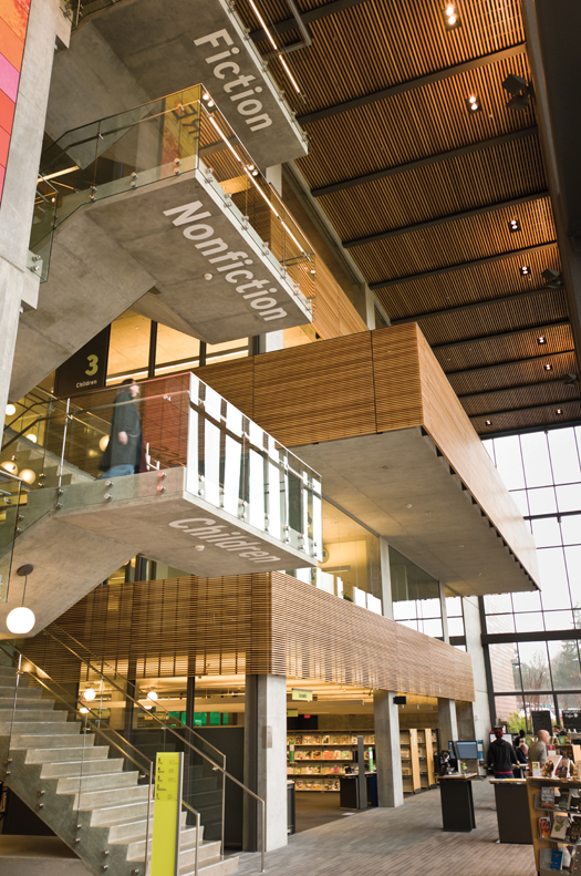
THINGS ARE LOOKING UP The underside of VCL’s five-story floating staircase provides patrons with strong wayfinding from the start
Wayfinding in libraries is too often an afterthought. But not in Vancouver, WA, where the newly constructed Vancouver Community Library (VCL) had signage planned into the design. The Fort Vancouver Regional Library District hired the Miller Hull Partnership architects as well as wayfinding specialists Mayer/Reed and AldrichPears for “interpretive installation.” The result is an intuitive setup that gives patrons the broad brushstrokes at a glance, while being future-proof enough to accommodate shifts in the collection in the years to come.
For these efforts, the design team was honored with a Merit Award in the 2014 Society for Experiential Graphic Design (SEGD) Global Design Awards Program, as one of 32 recognized for excellence in environmental graphic design from a pool of 412 entries. The award was presented to partner Michael Reed and associate partner and Kathy Fry on June 7 in Atlanta.
Signage at scale
The awards jury showed that the design succeeded in carrying through Ft. Vancouver’s forward-looking vision, saying, “This project shows what a library can be as opposed to what it has been traditionally” and calling the design “a seamless integration of architecture and wayfinding—a symphony of materials and finishes—a playful interplay of scale and architecture.”
Karin Ford, now public services director, was branch manager during the entire VCL project. She told LJ that emphasis on scale was not accidental. “Overall for wayfinding, we tried to emphasize simplicity, working with the scale of the [83,000 square foot] building, so the large dimensional numbers on each floor [embedded into the painted steel walls] fit with the scale of the stairway and the building in general,” she says. “[We were] trying to make it easy for people to glance and orient themselves so they don’t have to walk up to a detailed sign.”
Stairway to...fiction?
Perhaps the most playful and eye-catching aspect of the signage is superscale letterforms painted onto the concrete underside of the exposed stair landings to identify the collection locations. When this was first proposed, Ford says, the library was skeptical. “The architects said, ‘Oh, we have this cool idea,’ and we said, ‘Really? Would that look kind of tacky? What happens over time as nonfiction is no longer on the fourth floor?’ so they said they’ll be vinyl letters so someone in the future could take them off. They’re not permanently etched into the concrete. It turned out that the public responded really well to it.”
Says Ford, “It has allowed for a lot of movement of little parts of the collection without having to do wholesale sign replacement.” For smaller signage, the library selected designs with inserts, “so when we have to make a change it is not a huge deal,” Ford explains.
The stair labels help patrons who enter the building’s five-story atrium orient themselves at a glance to how far up they need to go, adds Ford. After that, of course, they need to sort out the details, which is handled by a combination of a directory at the foot of the floating staircase and a nearby welcome desk for individual questions.
An integrated aesthetic
The wayfinding look and feel are integrated with the architectural concept of a “drawer full of knowledge” and plays off the “knowledge wall,” a four-story piece of public art that features a steel grid over a concrete wall, from which are suspended colored panels printed with local imagery and words.
The team effort extended to Plumb Signs Inc., which fabricated the wayfinding signage, and Pacific Studio, which built and installed the Knowledge Wall. Ford says the wayfinding didn’t add much to the total cost of the project, since the end result was “fairly simple.” What it did take is time and effort to come up with the right simple solution. “It took a while to figure out what would work,” says Ford.
And, she says, it does work. The only flaw? Not carrying through the wayfinding sufficiently for those who don’t take the stairs. The most common patron request is that the library add a detailed directory in the elevator.
ALREADY A SUBSCRIBER? LOG IN
We are currently offering this content for free. Sign up now to activate your personal profile, where you can save articles for future viewing


Add Comment :-
Comment Policy:
Comment should not be empty !!!
tony rowland
ues the elvator system Really needs help. brought this up a few times. my wife ihas a power chair and must use it. Please take care of this.Posted : Aug 30, 2014 09:52
David
Enjoyed reading this article about such a cool design choice. Is it possible to use the image in this article for a blog choice. (Also, the first comment seems to be spam.) Thanks :)Posted : Aug 16, 2014 04:34