10 Steps to a Better Library Interior: Tips That Don't Have To Cost a Lot | Library by Design
, September 9, 2011
An interior designer weighs in with simple, effective, and inexpensive steps that can be taken to reinvigorate your library
At a time when many of our country’s libraries need an update owing to age and higher-than-ever expectations from patrons, available dollars for renovations are all too scarce. Fortunately, there are simple, effective, and inexpensive steps that can be taken to reinvigorate your library interior.1. SEE WITH YOUR CUSTOMER'S EYES
 |
You are in your building every day, so you probably don’t even see the interior anymore. Take a step back, and view your library with fresh eyes. Walk through the building as though it were your first time. Can you identify the areas of your library easily from the entry point? Is it clear where to go for help? Can you find the bathroom? What visual noise is in the way of these goals?
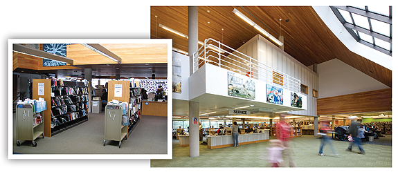
At Dakota County’s Wescott Library, MN, customers entering the building were confronted with the overflowing holds section, long lines for self-check blocking their way, and little clarity about the library’s overall layout.
With the holds and self-check stations pushed off to the sides, and the entry opened up to exterior views, with products and services beyond, the library now has a welcoming entry and intuitive flow. Much of the impact was achieved using mainly elbow grease to move collections and reorganize the interior. Additional changes include paint (40¢/sf) and carpet ($3.50/sf).
2. REMOVE BARRIERS
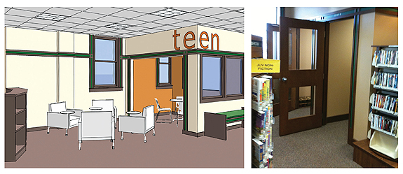
Find ways to remove visual and physical impediments to using your library and easily accessing the resources within. For example, if tall shelves are blocking sight lines from the entry, find ways to consolidate materials in order to remove shelving or lower the height. If built rooms close off an area that would get more use if opened up, remove the rooms.
These study rooms are underused and out of sight from customers. Consider what a simple move such as removing the doors and reorganizing the fixtures could do to create a more welcoming area, as in this mock-up for a study in the Bayport Public Library, MN. Suggested changes include paint (40¢/sf), door and wall removal and touch-up ($1500), new interior window ($15/sf), and new furniture ($25/sf).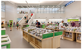 |
3. USE LESS FOR MORE IMPACT
If displays are taking over your library, consider paring them down so remaining fixtures have more impact. If you have painted walls to enliven your interior, did you use too many colors and lose the effect in the process?
Unify items such as displays through consistent use of materials or color, as in the Roseville branch of Minnesota’s Ramsey County Public Library—one of LJ’s New Landmark Libraries.4. UNCLUTTER
 |
Visually chaotic surroundings intimidate many library users. Where should customers focus their attention?
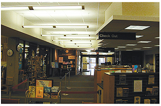
Resist the urge to add signs about every service or rule for using the building, and ask yourself why it isn’t intuitive in the first place. Then address the core issue. Chances are, customers are going to ask a person rather than visually sift through a series of notes anyway; each interaction is an opportunity to add value to the customer’s experience. Many libraries collect but forget to purge, leaving patrons to sort out what’s important visually, a problem Mt. Prospect Library, IL, faced before a renovation. 5. CONSIDER THE WHOLE
Don’t accept every cast-off piece of furniture, fixture, or other item that comes your way. Instead, consider the whole. Find ways to unify furnishings and fixtures through material, color, and form. Consolidate free materials and community notices with other self-service items, such as change machines, self-check stations, or copiers.
Prior to renovation, St. Paul’s Central Library had three different shelving types with different materials and finishes, as well as mismatched study chairs and tables. The result was visually jarring. A major role of the library’s $16M renovation was to simplify and clarify the interior, which involved jettisoning the mismatched furniture and keeping only the pieces in harmony with one another and the building itself.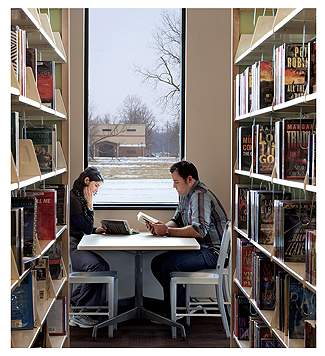 |
6. SUPPORT HOW HUMANS USE SPACE
People seek out natural light and views and want to be sheltered. Look for existing opportunities in the interior architecture to create reading nooks. Evaluate whether your seating takes advantage of natural light or views to the exterior, and think about whether shelves could be rotated or moved to let more daylight into the interior of the space. Make the most of interior brick by organizing the furniture to work with the cadence of the panels and add to the range of textures. Do the same with a sheetrock interior box by adding subtle or bold vinyl films to create visual texture.
Organizing shelving to work with—and not against—sources of natural light and views to the exterior can create magical little spaces like this one in the Louisville Free Library’s Newburg Branch, KY. In an existing space, this may require nothing more than a fresh eye and elbow grease.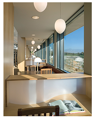 7. ZONE YOUR INTERIOR
Examine the space with noise in mind: find the sources of noise and activity within each area and seek to avoid conflicts in privacy, sense of security, sociability, and acoustics. You might own the most comfortable lounge chair ever manufactured, but if you locate it near the copiers or with its back to a main aisle, no one will sit there.
Locate quiet reading areas away from the fray. Use the building’s architecture or library shelving to create a sense of enclosure and help signal how to behave. These pendant fixtures at the Rancho Mirage Public Library, CA ($400–$800 ea.), also help bring the scale down and foster a sense of place. 8. CREATE A VARIETY OF EXPERIENCES
One size does not fit all. Allow customers to decide what type of social interaction they want, on a scale of none to lively collaboration. Don’t assume that seating is seating is seating—provide variety and choice.
Teens, in particular, appreciate choice in how to study or collaborate, which is playfully accomplished at the Bud Werner Memorial Library in Steamboat Springs, CO.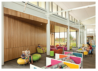 9.LIGHT TO SHAPE SPACE
When lighting is done well, we tend not to notice it; when it is done poorly, it can ruin an interior. In fact, many buildings actually are overlit. Our eyes need variety in light intensity so they can rest, but one must be careful of too much contrast as well—our eyes tire quickly when they must constantly adjust between, for example, a dark wall next to a bright window.
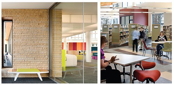
Vary lighting levels for visual interest and to cue behavior. At Hennepin County Library’s Maple Grove branch, MN, lower light levels in the lounge area—but still plenty bright for reading—signal that this is a quiet area in the wide-open floor plan. More light over the collections encourages exploration.10. EMBRACE COLOR
 |
Strategic use of color can direct attention toward an asset or draw it away from a liability. Color can help give boundaries to a space and signal how to behave. It can add warmth or liveliness or gravity. And, especially when applied through paint, it is easy and inexpensive to change, so you can alter your library interior over time.
No signs announce the children’s area of the Maple Grove branch, but vibrant color acts as a cue and draws the eye to that area even from the entry. Colorful acoustic fabric panels were installed for about $22/sf and also help mitigate the sound of excited voices. Simple use of color can direct attention to amenities, such as the enclosed study room in the small Newburg Branch of Louisville Free Library. Paint costs about 40¢/sf when done by a professional.11. BONUS ITEM
Hire a design professional to help you with bigger moves or a comprehensive plan, which can be broken into smaller projects. Many professionals are willing to charge by the hour. If you come to them with ideas about your goals, they can very quickly help you define the areas that have the most impact. Reputable design professionals in your area can be found on the website of the International Interior Design Association (www.IIDA.org ) and the American Institute of Architects (www.AIA.org). And don’t forget to ask around for referrals from colleagues who have worked recently with design professionals.
| Author Information |
| Traci Lesneski (traci@msrltd.com) is Principal and Head of Interiors for MS&R Ltd., a leading national library design firm based in Minneapolis |
This article originally appeared in print in the Library by Design supplement published by LJ on Sep. 15, 2011. Read on for more Library by Design articles and ongoing architecture coverage from LJ.
RELATED
ALREADY A SUBSCRIBER? LOG IN
We are currently offering this content for free. Sign up now to activate your personal profile, where you can save articles for future viewing


Add Comment :-
Comment Policy:
Comment should not be empty !!!