Improving Digital Access to Special Collections: A Call to Action | Backtalk
As Lorcan Dempsey, formerly with OCLC, observed in portal: Libraries and the Academy (2008), “discovery happens elsewhere”—that is, people are using internet search engines, recommendations from social media, or emails from friends and colleagues to discover content. Search can be a powerful tool, provided you know what you are looking for. Yet there are significant problems associated with the search process.
As physical collections are used less and less in academic libraries, increasing attention is being paid to library special collections. These special collections are typically named for their donor, and librarians and archivists have developed finding aids or descriptions of each collection to provide access. There are calls for most, if not all, of these special collections to be digitized.
The amount of money spent to digitize library collections is significant. Since 2014, the Institute of Museum and Library Services (IMLS) has spent $130,189,670 of Library Services and Technology Act (LSTA) funds (with an additional $98,180,011 in matching grant funds from participating libraries) on digitization projects. Large academic and public libraries have probably spent $150,000,000 or more digitizing their collections over the last 20 years. As of December 2022, the Library of Congress managed 21 petabytes of digital collection content, comprising 914 million unique files, with a particular focus on manuscripts, newspapers, and pictorial materials.
Typically, digitized content is held in a separate database and may or may not be found in a library’s online catalog. The Digital Public Library of America (DPLA) provides links to digital content from libraries, museums, galleries, and archives; as of October, it offered access to 51,491,687 images, videos, texts, and sounds from across the United States.
As Lorcan Dempsey, formerly with OCLC, observed in portal: Libraries and the Academy (2008), “discovery happens elsewhere”—that is, people are using internet search engines, recommendations from social media, or emails from friends and colleagues to discover content. Search can be a powerful tool, provided you know what you are looking for. Yet there are significant problems associated with the search process. Keyword searching is inherently limiting in that it requires a very specific query, and the search process discourages exploration (most users rarely go beyond the first screen of search results).
Conducting a Google search for “Civil war soldiers” and clicking images results in the Google image in Figure 1.
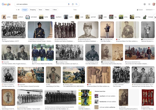 |
Figure 1. Google image display |
Note that the individual can refine their search by selecting one of the choices displayed at the top of the images, e.g., Union, uniform, animated, battle, Southern, and so forth. The search experience is intuitive, and it is possible to quickly narrow the results down to a manageable output.
Compare the experience of a Google image search with a library’s online catalog. For example, searching the Library of Congress’s catalog for “Civil War soldiers” results in 8,085 records retrieved, with three results shown, one by one, as seen in Figure 2.
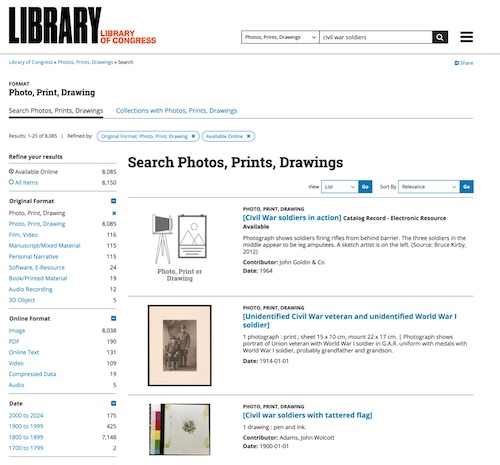 |
Figure 2. Sample Library of Congress search results |
Scrolling through an interminable number of screens to identify photos, prints, or drawings of interest is something that, for the most part, only a dedicated scholar or researcher will do. In my view, too much space is dedicated to displaying the metadata associated with each image. And while it is possible to refine or reduce the number of results using the options in the lefthand column, it is not clear how this will be helpful, as selecting one of these options still returns a large set of results.
Providers of content management software, sometimes called digital management or digital archives software, such as CONTENTdm, Quartex, Recollect, and DSpace, among others, have, for the most part, provided search options—but done a poor job with browsing. One exception is CONTENTdm, which does a fairly good job of showing content with minimal metadata, but there is a lot of wasted white space, as seen in Figure 3.
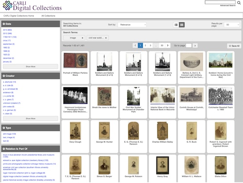 |
Figure 3. CONTENTdm Search Results Screen |
While browsing on the DPLA site is encouraged (Figure 4), the user still winds up needing to scroll single-record displays similar to those of the Library of Congress (Figure 5 shows four records, although the user can scroll down up to 30 records before needing to move to the second page).
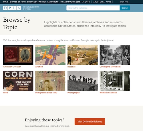 |
Figure 4. Digital Public Library of America Browse by Topic |
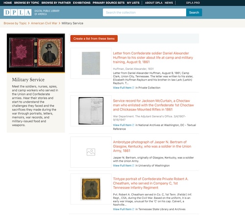 |
Figure 5. Digital Public Library of America Record Display |
All this digital content is stored in a wide variety of silos, which makes discovery difficult. It is as if librarians and archivists are attempting to hide digital treasures in the preverbal “digital haystack.”
In addition to being able to search digital content, users should be given the opportunity to access visualization tools that assist them in browsing or seeing what content might be of value. As early as 2007, in “Toward a Deeper Understanding of the Role of Interaction in Information Visualization” (IEEE Transactions on Visualization and Computer Graphics), Ji Soo Yi, Youn ah Kang, John Stasko, and Julie Jacko suggested that these tools should, at a minimum, allow the user to:
- Select—Gather a subset of data for further analysis
- Explore—Show different digital content
- Reconfigure—Arrange the displayed images and information in a variety of ways
- Encode—Display a different representation
- Abstract/Elaborate—Zoom in or out; show more or less detail
- Filter—Make choices using different criteria
- Connect—Show related items.
Users should be able to use two or more tools simultaneously, which would make it easier to gain a big-picture perspective and develop a deeper understanding of available digital content.
DISPLAY MATTERS
Because of the ubiquity of websites that provide access to content, users have become accustomed to a simpler, more direct browsing experience. Popular platforms that do a good job of displaying visual content include:
Flickr. Flickr displays three or four photographs in a row. Moving the cursor over the photo will display the title of the image, the name of the photographer, the number of likes, and comments. The user can create and curate their own gallery. Flickr Commons provides access to hidden photographic treasurers from more than 100 members, including the Library of Congress; other national libraries; and U.S. public libraries, archives, and galleries.
Pinterest. Pinterest allows people to share images and text on any topic they wish. The content is displayed in six columns, and the image can be of any size (Figure 6).
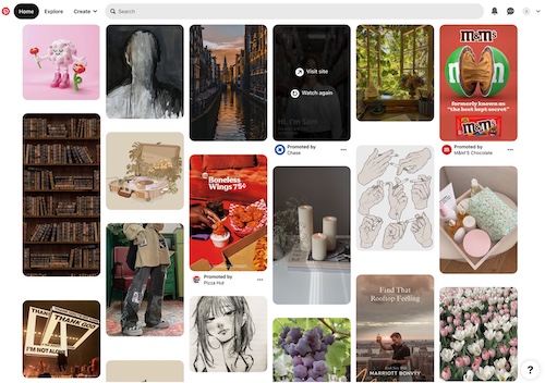 |
Figure 6. Pinterest Content Display |
The Collection Wall. The Cleveland Museum of Art provides a 40' x 5' interactive wall on which an image of every item in the collection is displayed. An individual can touch an image and it will enlarge, displaying the descriptive metadata. Visitors can download recommended tours or create their own. The Collection Wall display changes every 40 seconds, grouping works of art by 32 curated views of the collection.
The Art of Making in Antiquity. The website The Art of Making in Antiquity: Stoneworking in the Roman World clearly provides available options that convey what the collection contains (Figure 7).
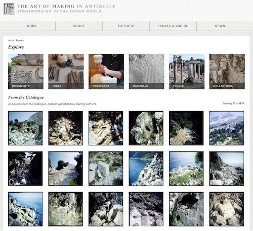 |
Figure 7. The Art of Making in Antiquity Website |
In 2015, Mitchell Whitelaw developed the concept of a “generous interface” that gives a sense of the massive collections in the National Archives of Australia. Whitelaw also created a browsing display for the State Library of Queensland in which all covers of Queenslander magazine can be viewed. The user can interact with the content by choosing a timeline, color of the cover, and/or tags.
Alice Thudt, Uta Hinrichs, and Sheelagh Carpendale’s The Bohemian Bookshelf also supports the serendipitous exploration of digital content, providing five tools for exploration: 1) book cover color, 2) keyword and tag chains, 3) timelines, 4) book length , and 5) author names, displayed in alphabetical order.
A CALL TO ACTION
For users to more easily discover and explore digital content, it is time for librarians, archivists, library consortia, and library associations to look to vendors of proprietary and open-source integrated library systems, providers of digital content management systems, and even DPLA to help them develop a complimentary set of tools that will encourage serendipitous browsing and exploration of the ever-increasing amount of digital content found in library collections. The development of a new browsing user interface by each system provider should be an iterative process that involves end users, librarians, and vendors.
The user needs a different set of tools to gain a broad perspective or overview of the total collection (a horizontal exploration), explore and investigate a subset of the collection, and finally examine in detail a single object or small group of objects and their associated metadata. In 2005, University of Maryland Professor of Computer Science Ben Shneiderman created an information-seeking mantra of “overview first, zoom and filter, then details-on-demand” that should be the foundation for the new browsing user interface.
Providing a robust set of visualization tools that a user can easily select will make the process of browsing of the ever-increasing amount of digital content more accessible. Among the tools that could be provided are:
Generous Display. The initial display should be generous and focus on the digital content itself, perhaps providing five or six thumbnails displayed per line. The user should be able to easily select a subset, as is the case with Google Images, or be able to select an option that is easy to choose with a single click of an icon.
Timeline. A timeline could be presented showing the number of images pertaining to a specific year or a range of years.
Location. Location is a helpful way in which to compare and contrast information from multiple sources, particularly maps. Location also helps to show relationships with other data. One example is the subway map showing the stations along each subway line, first developed by Harry Beck in 1931 for the London Underground.
Relationships. A variety of diagrams could be selected by the user showing the relationships of digital objects using the associated metadata for each object. Among the possible types are: network diagrams, histograms, Venn diagrams, tree charts, polar graphs, and area charts. Hierarchy is another way in which to display relationships (e.g., parent-child). The system’s software would display these relationships using the associated metadata.
Color. Color can be a very effective way of categorizing a large groups of images where appropriate to the type of collection.
Animation. Animation can also work to explore and select a subset of digital content.
Word Clouds. Word or tag clouds can represent metadata associated with a collection. Allowing a user to select one or more words as a way to create a subset of the collection can provide a useful tool. Word clouds can be constructed using the metadata associated with each digital image.
Type of Material. Limiting a display by type of material can create a subset of the collection.
Names. Providing a display of names of the creator, photographer, artist, author, illustrator, and so forth can be helpful, especially if the names are linked using a network display.
Collaboration. In my book Adding Value to Libraries, Archives, and Museums: Harnessing the force that Drives Your Organization’s Future (Libraries Unlimited, 2016), I noted that encouraging the participation and collaboration of users was vital for maintaining the presence and value of the library in people’s lives. Crowdsourcing, where feasible—encouraging people to add tags, transcribe hard-to-read text, and otherwise add valuable context—can make digital content more accessible. Users have transcribed restaurant menus held in the collection of the New York Public Library and the text of historical newspapers held in the National Library of Australia’s collection.
THE GOAL
The goal of providing a rich browsing interface for the vast collections of digital content is to encourage and facilitate serendipity. While the historical focus of serendipity has been the accidental or unexpected discovery of something new, it is possible to encourage serendipitous discovery of digital content as part of the search process through a user-focused interface.
A new browsing interface should:
- Show first results using a generous interface
- Provide multiple, flexible ways for the user to start exploring
- Show the relationships between items
- Provide context by linking content and encouraging users to add context
- Provide clues and samples (using the digital content)
- Always provide options and never dictate the user’s journey
- Publish high-quality primary content
The investment in creating digital content is significant, and creating a new user-focused browsing interface will improve the return on investment and prevent libraries and archives from creating digital “just-in-case” collections that are rarely used.
Joseph Matthews has provided consulting assistance to numerous academic, public, and special libraries and local governments. He is the author of more than 30 books, including Adding Value to Libraries, Museums and Archives.
ALREADY A SUBSCRIBER? LOG IN
We are currently offering this content for free. Sign up now to activate your personal profile, where you can save articles for future viewing






Add Comment :-
Comment Policy:
Comment should not be empty !!!