LJ Talks to Cartoonist Sophie Yanow
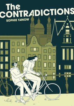
The Contradictions, Sophie Yanow's Eisner-winning webcomic, now a full-length graphic novel, chronicles a youthful examination of conscience through the story of a young woman trying to live her convictions in a complicated world. Here, Yanow shares her influences and the process of creating this sharply observed, precisely penned work.
 The Contradictions (Drawn & Quarterly, Sept.; Web Exclusives, 9/4/20), Sophie Yanow's Eisner-winning webcomic, now a full-length graphic novel, chronicles a youthful examination of conscience through the story of a young woman trying to live her convictions in a complicated world. In a recent email interview with LJ, Yanow shared her influences and process in creating this sharply observed, precisely penned work.
The Contradictions contemplates the intimate work of articulating one's convictions, a quest often considered the province of twentysomethings. But the massive upheavals of this year have us all looking at the gulf between our daily lives and personal ethics. What readers were you considering when crafting this story, and what is your sense of the book’s impact so far?
The audience I had in mind was anyone who had been through a difficult time when it came to figuring out what they believe in, or anyone presently going through that. When I began to realize how complex the world is, I struggled a lot. I think my categories of "good" and "bad" were fairly firm. My understanding of how the world works was, of course, a vast simplification. As a culture, I think we view our twenties as a time of discovery, but it's an ongoing process, especially during a forced period of introspection like this one.
 Architecture plays an important supporting character in your story. Did you set out to explore such a deep sense of place in the narrative? Or did it happen organically as the story developed?
I wanted to have a lot of specificity when it came to a sense of place. I spent a lot of time looking at places I had visited and hitchhiked to. I wanted that feeling of being somewhere specific, in a given European city, and then being in those weird nowhere places when you're on the outskirts of a city, trying to catch a ride, or the gas stations that are the same but a little bit different when you're on the road. The style was intentional in that I didn't want it to be as impressionistic as my previous work. I wanted the various places to feel solid.
You capture the "elsewhere" atmosphere of study abroad extremely well. How did you go about developing that experience visually and narratively? What is important about this opportunity; why tell this story?
I think that anything that takes me out of my routine can put me in a state of mind that's open to change and self-discovery. Even taking a day trip or going on a bike ride on a street I've never been down. Solo travel kind of does that on a large scale. You don't go home at the end of the day, or at least not to a home where you have a habitual way of doing things. For me, that can be very anxiety-inducing. I was often the kid who asked to get picked up from slumber parties. But I also know it's a big opportunity for growth. When I studied abroad, I was expecting and even hoping for a shakeup—I wanted to make some of that anticipation explicit, where the character is narrating at the beginning, but then let that narration fall away as we see if her expectations are met. I was really taken with your economical and purposeful artistic style.
Who are your inspirations and guides?
John Porcellino is the master of economy. His work taught me to trust the negative space. I love Gabrielle Bell's drawings, and the size of the figures and spaces in her work. She draws in a way that has European "clear line" influence, but in this black-and-white style that is also inspired by North American alternative comics artists like Julie Doucet. I learned a lot about "acting" in comics from Belgian cartoonist Brecht Evens, a master of drawing uncomfortable conversations, and also having compassion for a wide range of characters. Dash Shaw's Bottomless Belly Button showed me that you can invent new visual languages while still having a cohesive narrative.
RELATED
ALREADY A SUBSCRIBER? LOG IN
We are currently offering this content for free. Sign up now to activate your personal profile, where you can save articles for future viewing


Add Comment :-
Comment Policy:
Comment should not be empty !!!